

Project Meratas
FinTech | Interaction Design | UI Design | UX Research
Company: Meratas/Career-Bond
Role: UX Designer
Focus: Redesigning a FinTech loan platform to increase user trust and improve conversion through clarity and transparency.
Deliverable: Research-backed UX proposal presented to client stakeholders.

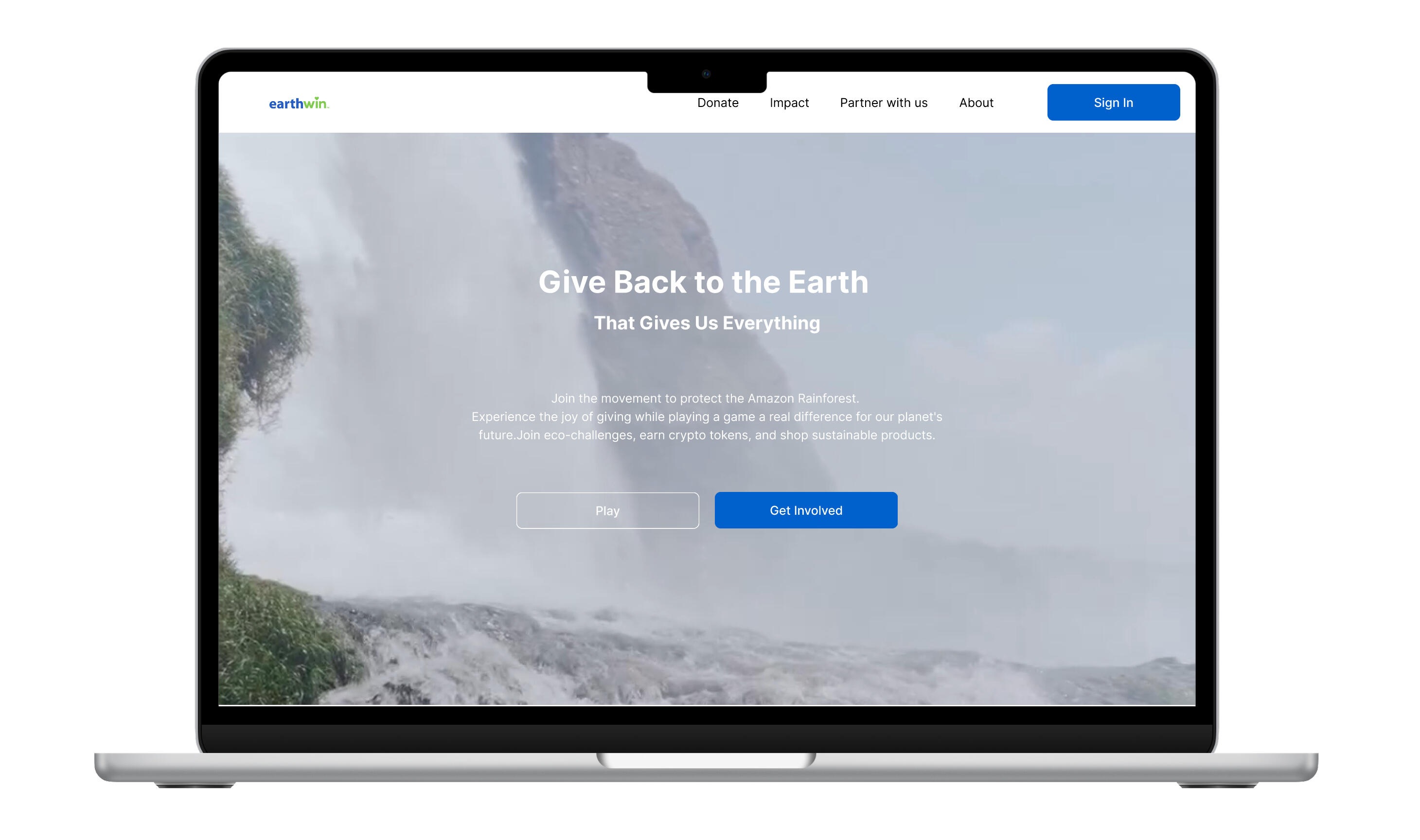
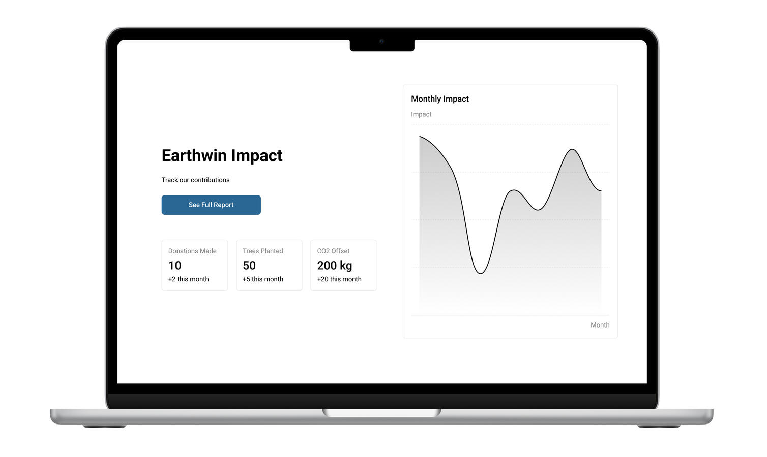
Project Earthwin
Environmental | UX/UI Design | Advanced Prototyping | UX Research
Company: Earthwin
Role: UX Designer
Focus: Designed a concept platform connecting eco-actions to real impact. Built an AI-visual game interface turning user emotion into measurable action through tokens and transparent rewards.
Deliverable: High-fidelity prototype demonstrating interactive reward mechanics and sustainable user journeys.
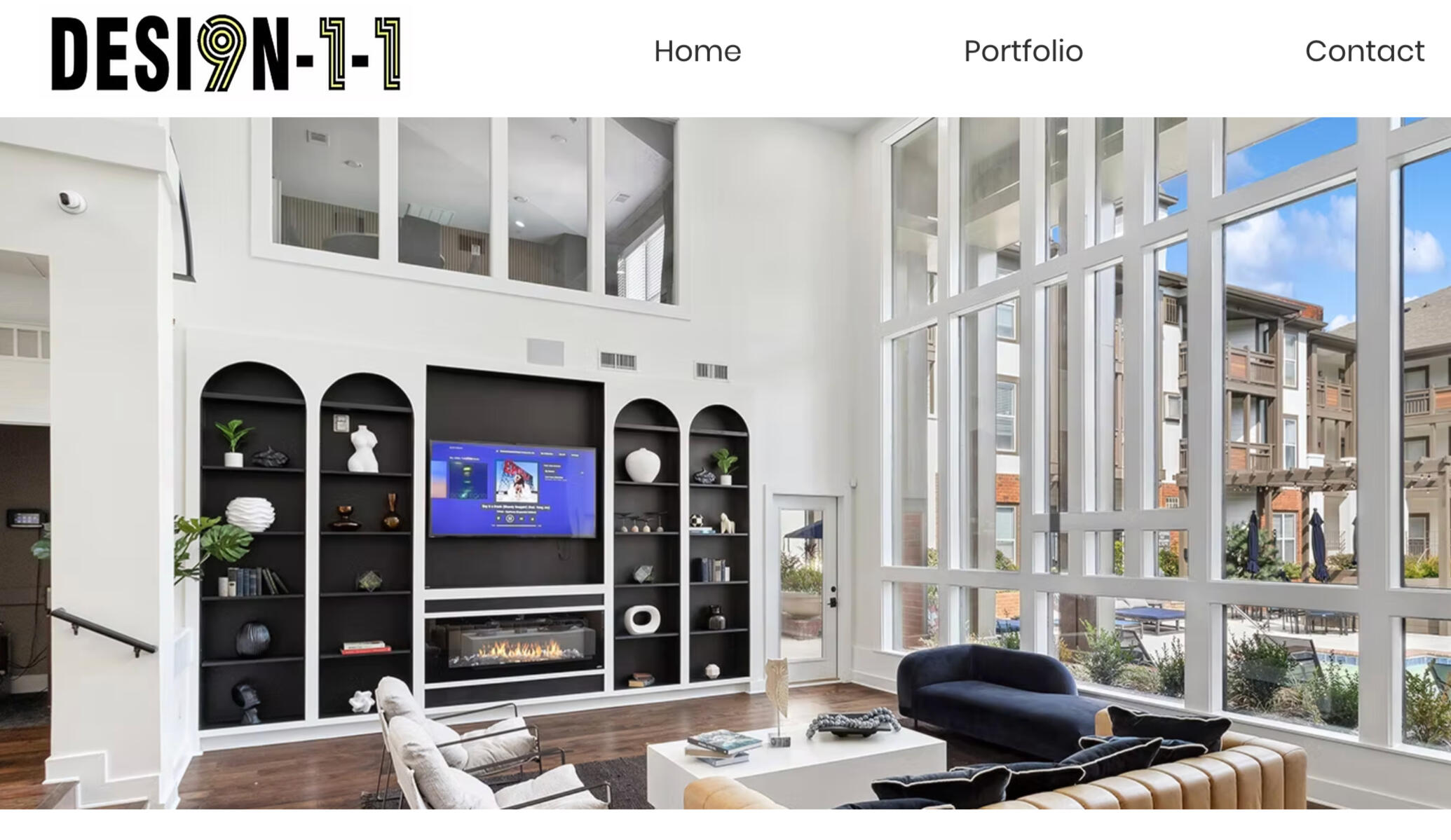
Project Desi9n-1-1
AR-Lidar-Interior Design | UX Research | Advanced Research | Interaction Design
Company: Desi9n-1-1
Role: UX Researcher
Focus: Investigating user trust and adoption for an AR-based LiDAR wellness scanner.
Deliverable: Comprehensive research report and MVP recommendations.
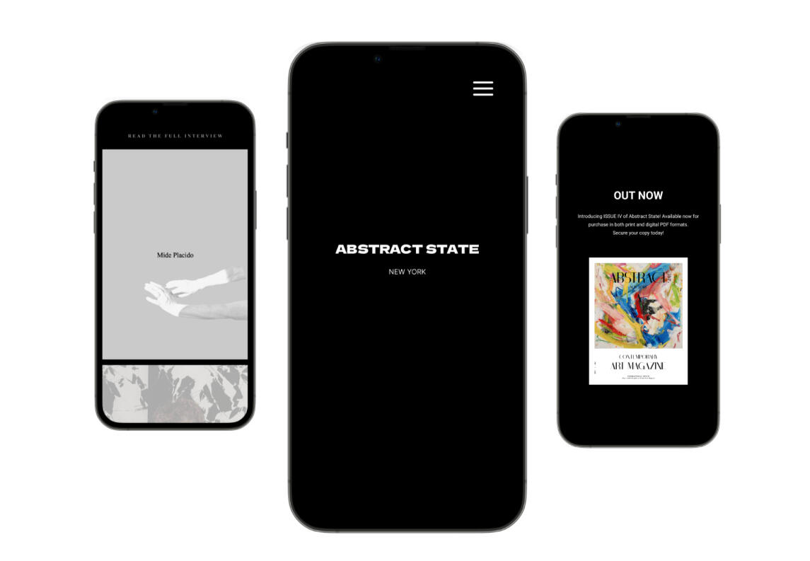
Project Abstract State
Art | Product Design | Branding | Editorial |UX/UI Design
Company: Abstract State
Role: Founder & Product Designer
Focus: Contemporary art magazine + digital platform (brand, editorial, website, e-commerce).
Deliverable: Quarterly print & digital issues; integrated website and shop.
COMING SOON...
Desi9n-1-1
AR LiDAR Interior Design | Research Project
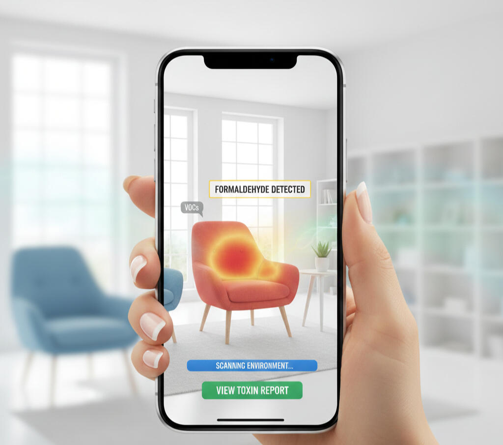
This project explored how AR and LiDAR can enhance human awareness of indoor environmental health. The study examined how data visualization can make invisible toxins visible, understandable, and actionable, bridging the gap between data and personal design decisions.
⚡ AT A GLANCE
Role: • Role: UX Researcher & Strategist • Deliverable: Strategic MVP roadmap + AR concept validation
Research
• 60+ participants, mixed methods (card sorting, photo elicitation, journey mapping)
Challenge
Users lack compact tools to identify which furniture causes poor air quality
Solution
Strategic MVP roadmap prioritizing mobile-first, scientific evidence, and source identification
Impact
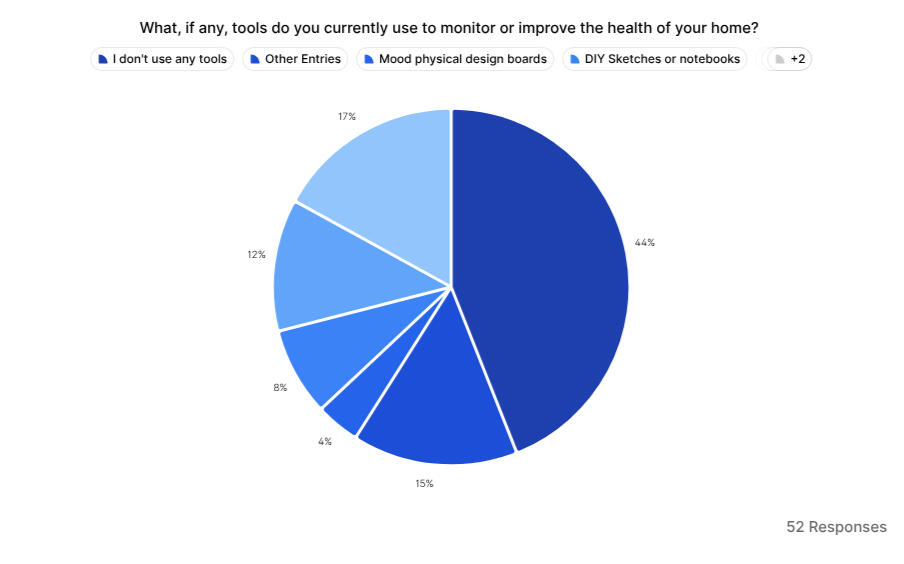
100% mobile preference validated; defined 3-pillar adoption framework for AR health tech
| %100 | 60+ | 44% |
|---|---|---|
| Mobile Preference | Research Participants | Use No Health Tools |
| All participants chose smartphones over tablets or AR glasses | 9 surveys + 2 in-depth interviews + 50+ group survey | Gap in current wellness monitoring solutions |
The Challenge
Indoor air quality monitoring faces three critical barriers
preventing user adoption and actionable decision-making:Problem 1: The Source Gap (User Pain Point)
Users lack compact tools to identify which specific furniture
or design elements are causing poor air quality. Existing
solutions show aggregate data but don't pinpoint the toxin
source.Problem 2: The Awareness Gap (Market Opportunity)
44% of surveyed users use NO tools to monitor home health,
despite growing wellness awareness. Current solutions prioritize
aesthetics over actionable health intelligence.Problem 3: The Trust Gap (Adoption Barrier)
Users distrust AI-generated health alerts without scientific
backing or expert validation, creating resistance to new
monitoring technologies.
Understanding the User
Through Mixed-Methods Research we studied behavior, trust, and adoption factors.Participant BreakdownTech & Design Professionals: The largest group, critical for testing assumptions on AR/LIDAR adoption (6 participants).Wellness-Focused Homeowners: The core target market, focused on health outcomes (3 participants).Interior Design Enthusiasts: Focused on aesthetics and style integration (2 participants).
| 2 | 9 | 50+ | +60 |
|---|---|---|---|
| In-depht interviews | Indivual Survey | Group Survey | Total Research Participants |
Research Approach
Methods used:• Card Sorting → Feature and trust-factor prioritization• Photo Elicitation → Space psychology & visual preferences• Journey Mapping → Reactions to air-quality alerts and decision flows• Surveys + Interviews → 60+ participants
Central Research Question
What would you do if your smart device alerted you about poor air quality?
This question became the foundation for understanding user behavior, device preferences, and trust dynamics.
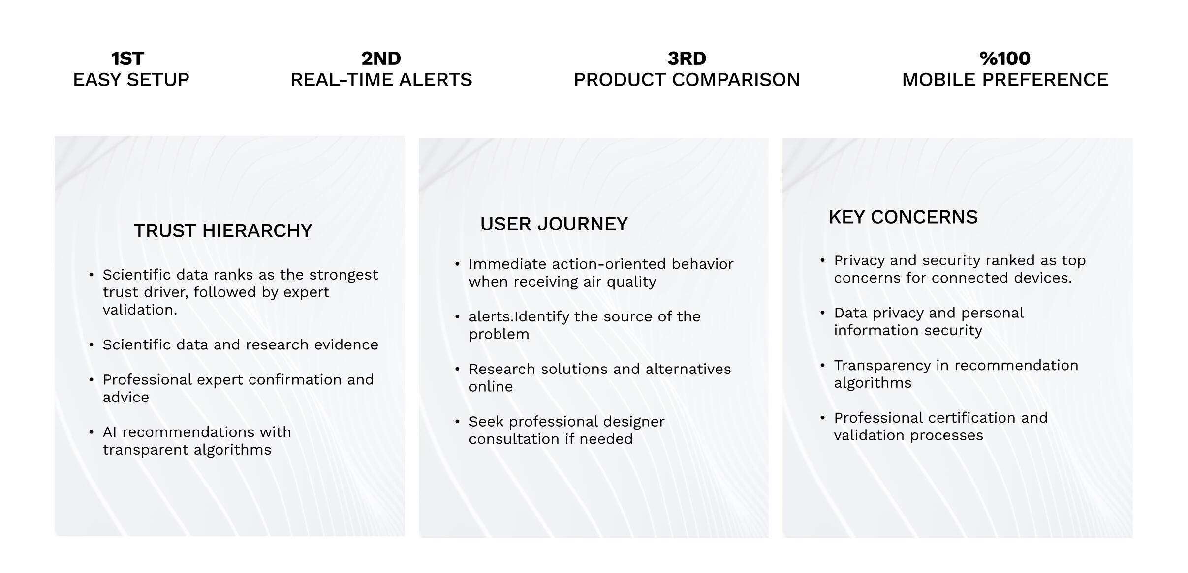
Key Strategic Insights
Finding 1: Trust Requires Scientific Evidence Users rely on scientific data and expert validation (not AI alone) to trust health alerts. Transparency is non-negotiable for adoption.
→ Solves Problem 3 (Trust Gap)
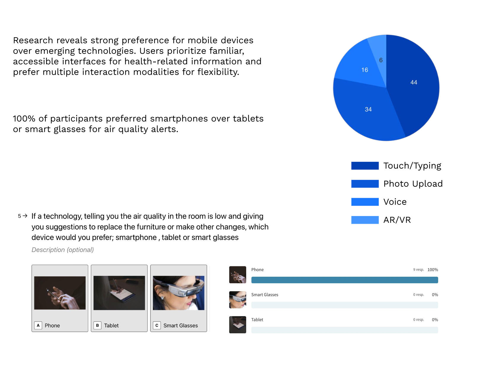
Finding 2: 100% Mobile-First Preference. All participants chose smartphones over tablets or AR glasses,proving the need for a mobile-first strategy.
→ Solves Problem 1 (Compact Tool Need)
Finding 3: Predictable User Behavior Pattern Alerts trigger immediate response: Identify Source → Research Solutions → Consult Professionals. Design must support this natural flow.
→ Solves Problem 2 (Actionable Intelligence)
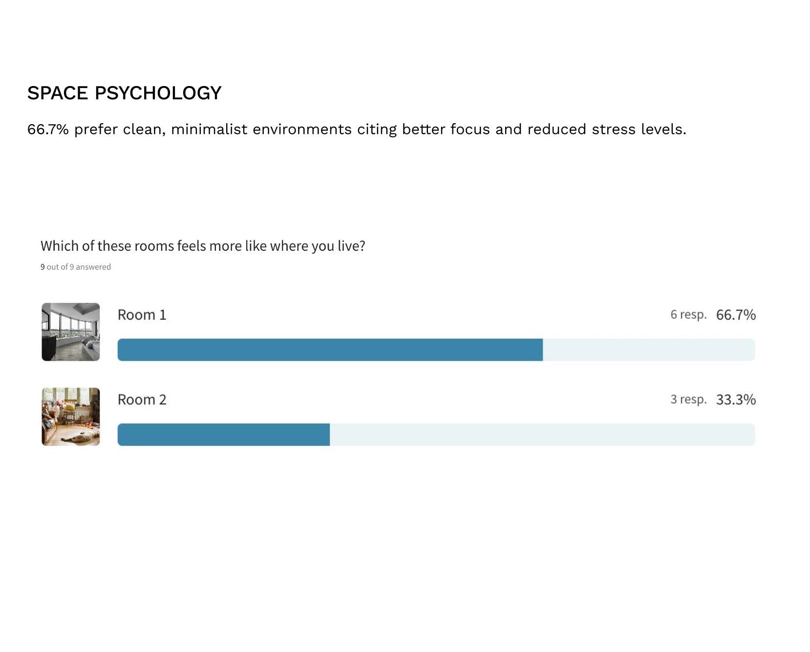
Finding 4: Minimalist Aesthetics = Trust 66.7% preferred minimalist environments, linking clean visual design to wellness perception and control.
→ Informs Visual Strategy
Strong Mobile Preference
100% of participants chose smartphones over tablets or AR glasses, proving the need for a Mobile-First strategy..
Behavior Orientation
Alerts trigger a predictable, immediate response: Identify Source, Research Solutions, Consult Professionals.
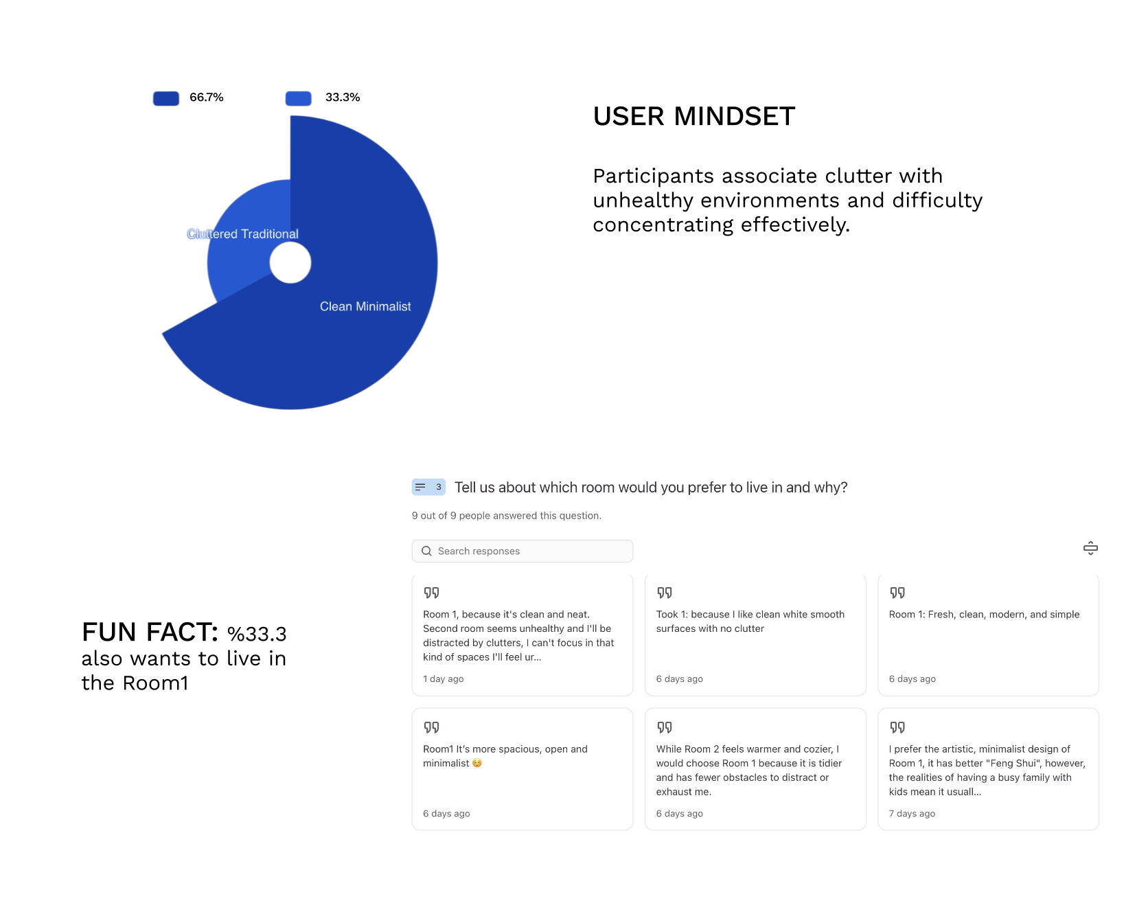
Space Psychology
66.7% preferred minimalist environments, linking clean design to wellness and control.
Strategic MVP & Design Implications
Based on research findings, the strategic recommendations directly address each identified barrier:Strategic Recommendations for MVP→ Solves Problem 1 (Source Gap): AR-LiDAR pinpoints toxin source in furniture.→ Solves Problem 2 (Market Gap): Mobile-first approach targets 44% non-adopters.→ Solves Problem 3 (Trust Gap): Scientific evidence + expert validation frameworkResearch exposed a clear direction for Tanit's MVP, focusing on three core pillars: Mobile-First, Trust Through Evidence, and Comparison Features.
Conclusion & Next Steps
This 7-week research cycle revealed that trust, transparency, and simplicity shape adoption of complex technologies. By merging behavioral psychology with LiDAR data, the platform transforms air-quality monitoring into an active decision-making support tool.Implementation Roadmap: Next steps include creating an interactive mobile prototype focused on the Scan, Diagnose, Act user flow, followed by prototype validation with environmental experts and AR testing in real homes.
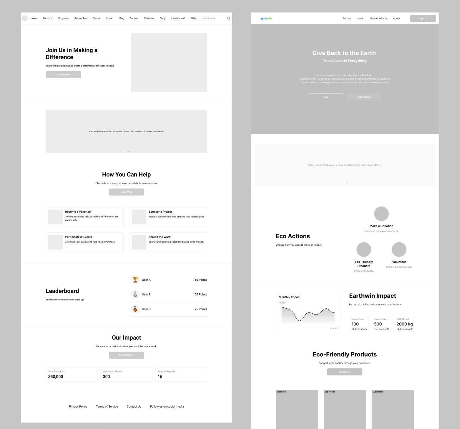
Earthwin
Environmental | Advanced Prototyping | Behavioral Design
Project Goal: Improve post-donation engagement and trust on the Earthwin platform by testing whether high-visibility impact tracking and feedback loops could reduce the 3 out of 4 user drop-off rate observed after first-time contributions.
⚡ AT A GLANCE
Deliverable: High-fidelity game prototype (Earth Fighters) with token economy and blockchain integration
Role: UX Designer • Behavioral Design
Timeline: 7-week client-driven project
Research & Findings
Methodology:4 user interviews across tech, business, and environmental backgrounds to identify trust and engagement gaps in the donation flow.Observed User Patterns
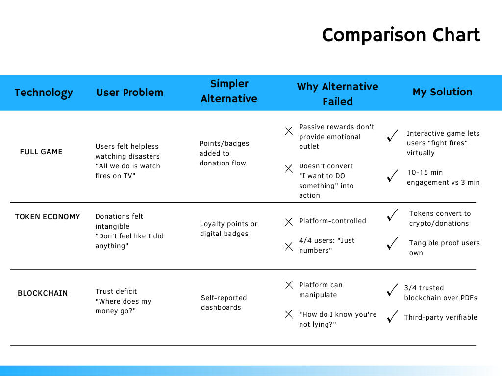
The One-Time Trap — 3/4 users donated once and never returnedThe Post-Payment Exit — 3/4 exited after the confirmation screenThe Transparency Gap — 4/4 users asked: “Where does my money actually go?”
Heuristic Analysis
The Audit: A formal evaluation of the original platform using Nielsen’s 10 Principles to identify 12+ navigation redundancies.Insight: Discovered that complex information was buried under repetitive "Partnership" loops, causing immediate user overwhelm.
Behavioral Mapping
The Strategy: Analyzed user behavior to channel high user urgency into constructive actions through a habit-forming engagement loop.Insight: Established the Eco-Cycle (Discover → Act → Earn → Prove) to transform one-time frustration into measurable, repeatable contribution.
Challenge
• Users couldn't track donation impact or see where money went
• No constructive outlet for environmental frustration and helplessness
• 3 high-friction technologies to integrate without overwhelming users
Solution
• Earth Fighters game (behavioral system)
• Token-based reward economy
• Blockchain-verified impact proof
Impact
•3/4 users trusted the platform more when impact was visible
• Designed behavioral system that channels frustration into repeated engagement
• Validated that 3/4 users trust blockchain-verified impact over traditional reporting
• Prototype delivered to stakeholders
PROJECT CONTEXTScope: This project designed a standalone game application (Earth Fighters), not gamification elements added to the existing Earthwin.org platform.Earthwin initially requested gamification (points and badges) to increase engagement. However, user research revealed a deeper need: users wanted to actively express environmental urgency, not just earn passive rewards.Key research insight:
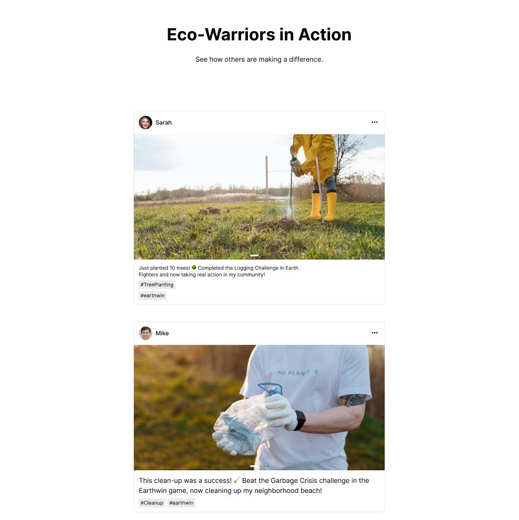
When asked "What would you do if you saw someone starting a fire in a forest?" users expressed anger, helplessness, and urgency - but had no outlet for those feelings beyond watching on TV or making a donation that "didn't feel like doing something."This informed my decision to design a full interactive game rather than simple gamification, translating the client's requirement into a solution grounded in user psychology:• Gamification request → Earth Fighters Game — Allows users to actively battle environmental threats (fires, mining, pollution), converting frustration into repeated constructive action
• Blockchain → Trust Infrastructure — Addresses "Where does my money go?" transparency gap
• Cryptocurrency → Impact Proof Layer — Tokens earned in-game convert to crypto for donations or Earthwin shop purchases, creating tangible proof of contributionMy role was to validate whether this elevated solution reduced user friction and improved engagement beyond what simple gamification could achieve.
The Challenge
Problem 1: The Engagement GapInterviews with 4 participants revealed three critical barriers:• Invisible Impact: Users couldn't track where money went (4/4 mentioned)
•Emotional Stagnation: No outlet for environmental frustration (4/4 mentioned)
• Low Retention: Immediate abandonment after one-time donations (3/4 mentioned)"I'd do something if I could actually see it matter" (4/4 users)

Problem 2: Trust & Complexity Barrier (Strategic Challenge)
The platform needed to integrate three high-friction technologies (behavioral system, cryptocurrency, impact tracking)
without overwhelming users or eroding trust.Problem 3: Navigation Redundancy & Cognitive Overload
Heuristic analysis of the existing platform revealed critical violations of "Recognition Rather Than Recall" and
"Aesthetic and Minimalist Design."• Redundancy: The "Partnerships" page contained unnecessary buttons that duplicated landing page content, disrupting user flow.• Implementation Gap: The "Earthwin Challenge" was marketed as an interactive experience but was actually a static YouTube video.My role was to design how these systems would function as a seamless user journey turning the "Challenge" from a video into a functional Earth Fighters game and the "Points" into a Blockchain-verified tracking system.
Our Approach
With three complex technologies to integrate (gamification, cryptocurrency, and blockchain), I used a validation-driven design process focused on reducing user friction rather than adding feature complexity.
The goal: Validate whether advanced technologies could solve user trust and engagement problems more effectively than simpler reporting tools.
1. Map Behavioral Psychology
I used the “forest fire” interview scenario to understand high-urgency emotional responses and designed Earth Fighters as an engagement system that converts awareness into repeat participation.2. Simplify Complex Systems
I translated technical requirements into clear user-facing functions:• Game: Engagement system + habit formation loop
• Tokens: Portable proof of contribution
• Blockchain: Trust infrastructure for transparent impact tracking3. Test & Iterate
Each system was validated through usability feedback to ensure it reduced cognitive load and improved clarity rather than introducing complexity.
Understand The Business: The Eco-Cycle
The core business objective was to ensure long-term participation through a verifiable funding model. Based on the user research, I designed how the client's required technologies would function as a loop.Play (Channel frustration into the game) → Earn (Tokens/Reward) → Convert (Tokens to Crypto/Funding) → Contribute (Real-world impact)This functional model bridges the digital action with the financial outcome, ensuring emotional engagement directly drives transparent funding and participation.
Understand The User
Interviews showed that users care about environmental causes but disengage when they cannot see visible outcomes from their actions. Participants consistently expressed the need for progress visibility, contribution tracking, and clearer feedback after donating.
The Key Quote:
“I’d do something if I could actually see it matter.”
This insight shaped the product direction: design environmental participation around transparency, progress visibility, and repeat engagement.
Research MethodologyI conducted in-depth interviews with 4 participants• 2 professionals in technology
• 1 business professional
• 1 environmental enthusiastThe goal was to identify behavioral friction points and disengagement patterns on the existing platform.
Behavior BreakdownCurrent Usage Pattern
Users treated Earthwin as a one-time transaction, not an ongoing experience.4/4 users: Homepage → Donate → Exit (under 3 minutes)
0/4 created accounts or returned
3/4 closed tab immediately after donatingPrimary Drop-Off Point
After donation, users searched for impact proof but found nothing:3 users expected a confirmation page with "what happens next"
2 users checked email for detailed receipts (found only payment confirmation)
1 user clicked "Our Work" looking for their contribution tracking
"I donated $20, but then what? There's no way to see if it did anything."Failed Engagement Attempt
Users clicked "Earthwin Challenge" expecting a game → found a YouTube video instead.4/4 expected interactive challenges
Homepage promised "game mechanics" but none existed
"I thought I'd be playing something, not watching a video."Primary Friction Drivers
Navigation redundancy and missing transparency features caused early exits:"Donate" button appeared 4 times on one page - users clicked different versions expecting different outcomes
4/4 asked: "Where does my money actually go?"
3 users clicked "Our Work" hoping to see funded projects
All users checked email for detailed receipts - found only generic confirmations
Key Diagnostic QuestionThe primary line of inquiry focused on identifying and channeling intense emotional responses: "What would you do if you saw someone starting a fire in a forest?"Finding: The resulting responses of anger, helplessness, and urgency became the psychological foundation for the Behavioral Engagement System (The Game).This question revealed that users possessed strong emotional drive to take action on environmental issues, but existing platforms provided no outlet to channel that urgency into meaningful, trackable contributions.Key insight: The problem wasn't lack of motivation - it was lack of visible progress, verifiable impact, and continuous engagement loops that could transform one-time frustration into sustained participation.
From Observation to Opportunity (connecting behaviors to solution)The pattern across all 4 participants: users wanted to stay engaged, but the platform had no infrastructure for ongoing participation.The disconnect:❌ No impact tracking
❌ No reason to return
❌ No proof their donation matteredThis behavioral evidence informed the hypothesis: blockchain-verified tokens + gamification could transform one-time donors into repeat participants.
Understand The Platform
Information Architecture & Platform Design: The existing Earthwin website buried strong ideas under cluttered navigation and repetitive pages. Crucially, the client's required features (gamification, token system, crypto tracking) needed to be designed and integrated - they did not yet exist on the platform
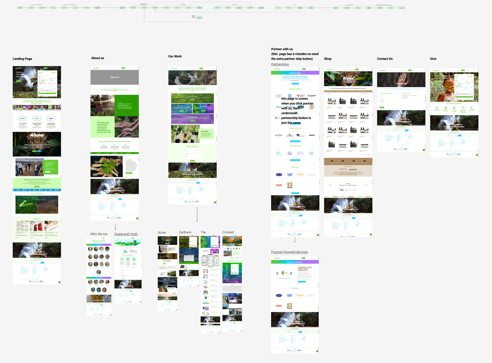
The Problem: Heuristic & Structural Flaws
During heuristic analysis, I identified a recurring issue: redundant navigation and cognitive overload. The existing structure violated principles like “Recognition Rather Than Recall” and “Aesthetic and Minimalist Design,” overwhelming users and obscuring the platform’s core message.
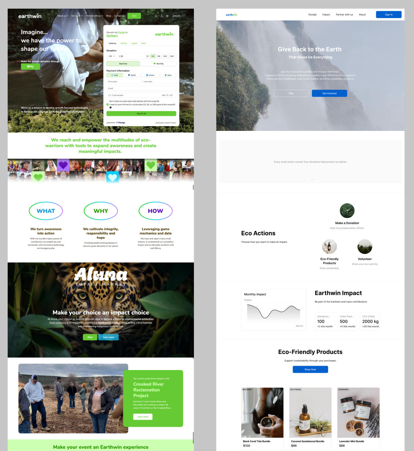
Design Evolution
From Audit to Architecture I identified 12+ navigation redundancies in the original layout (left).
My early wireframes (center) focused on establishing the linear 4-step Eco-Cycle to reduce cognitive load.
Initial aesthetic tests showed that a "cartoonish" style trivialized the cause for 4/4 users; I pivoted to a high-fidelity elemental style to reinforce mission credibility.
The final high-fidelity design (right) integrates the Behavioral System and Blockchain tracking into a seamless, trust-based interface.
Technology Trade-off Evaluation
The client requested gamification. User research revealed users needed an active outlet to express environmental urgency - not just passive rewards. I validated whether a full game + token economy + blockchain solved this better than simpler alternatives.
Why a Full Game (Not Just Gamification)?
The client initially requested gamification (points/badges). However, the "forest fire" research scenario revealed users wanted to actively express urgency, not just earn passive rewards.User quote:
All we do is watch forest fires on TV. Unless you're a firefighter, you can't do anything. With a game, at least I could express my feelings, earn tokens, and use them to donate or buy from their store.Gamification vs. Game Design:Gamification = Add points after donation (passive reward)
Game Design = Active participation that channels environmental frustration into constructive repeated action
Validation: 4/4 users engaged 10-15 minutes with game prototype vs 3 minutes on donation-only flow.
Why Not Traditional Reporting?
Static PDF impact reports do not create continuous engagement. Multiple users stated they “would not check monthly email updates.”Why Blockchain?
To create a contribution ledger that users can independently verify rather than relying solely on platform claims.Risks & Mitigation
High onboarding complexity for non-crypto users was identified as a major risk. This was mitigated by abstracting the blockchain layer from the interface and displaying a simple “Verified Contribution” status instead of exposing wallets or transaction details.Game trivialization risk: 4/4 users rejected cartoonish aesthetics as trivializing → pivoted to cinematic elemental style
Non-gamer complexity: Simple tutorial + clear visual cues → 4/4 understood mechanics in first interaction
Design Assumptions & HypothesesBased on observed behavior patterns, I formed three testable assumptions:Hypothesis 1: If users receive visible proof of impact instead of a static donation receipt, they will be more likely to return to the platform.Hypothesis 2: If actions feel cumulative (gameplay + progress tracking) rather than isolated one-time donations, user retention will increase.Hypothesis 3: If feedback loops are immediate and verified, perceived trust in the platform will increase.
The Solution
The redesign focused on removing redundancy and establishing a clear hierarchy to support three interconnected layers: Gamify Impact, Reward Participation, and Prove Contribution.
Client Requirements, Research-Driven DesignThe client required gamification, a token system, and blockchain verification. Based on research identifying the need for sustained motivation and engagement, these requirements were translated into three core features:
Feature 1:
Earth Fighters (Behavioral Engagement System)
Converts high user urgency into meaningful action through gameplay.
→ Solves Problem 1: Low engagement
Feature 2:
Smart Token Economy
Tokens act as impact currency for donations and eco-friendly purchases.
→ Solves Problem 1 & 2: Sustained participation
Feature 3:
Blockchain-Verified Impact
Transparent proof of real-world contribution.
→ Solves Problem 2 & 3: Trust & complexity
Designing the Solution
The platform was structured to convert feelings of powerlessness into meaningful, trackable action:
Gamify Impact: Earn tokens by completing eco-challenges based on real-world issues (wildfires, mining, pollution).Reward Participation: Tokens can be spent on donations or eco-friendly purchases.Prove Contribution: Tokens convert into blockchain-verified records, providing transparent proof of impact
Psychology-Based Design
Research showed that urgency, not apathy, drives disengagement.
Engagement System: Turns user urgency into repeat participation.Immediate Feedback: Token rewards reinforce motivation.Long-Term Value: Blockchain creates verifiable, lasting proof of contribution.
Smart Token Flow
The token system provides immediate, trackable feedback and encourages ongoing engagement through meaningful actions.
Play & Earn: Tokens earned through eco-actions (donations, invites, purchases).Gift & Grow: Tokens can be gifted to support trees or carbon-offset projects.Prove & Store: Tokens convert to crypto, producing verifiable blockchain records of contribution.
Flow & Structure
Earthwin’s ecosystem is designed as a self-sustaining cycle that motivates action and rewards participation.
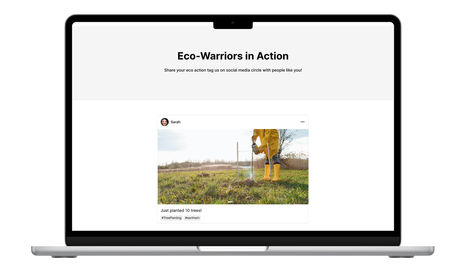
The user journey follows a clear rhythm of Discover → Act → Earn → Prove → Share, ensuring every interaction feels purposeful and connected.Each part of the experience dashboard, game, shop, and volunteer hub feeds into this loop:
users discover environmental challenges, take meaningful action, earn impact tokens, and see their verified contributions visualized in real time.This structure keeps engagement continuous and reinforces Earthwin’s core goal: turning environmental emotion into measurable impact.

Discover →

Act & Earn →

Prove →

Share
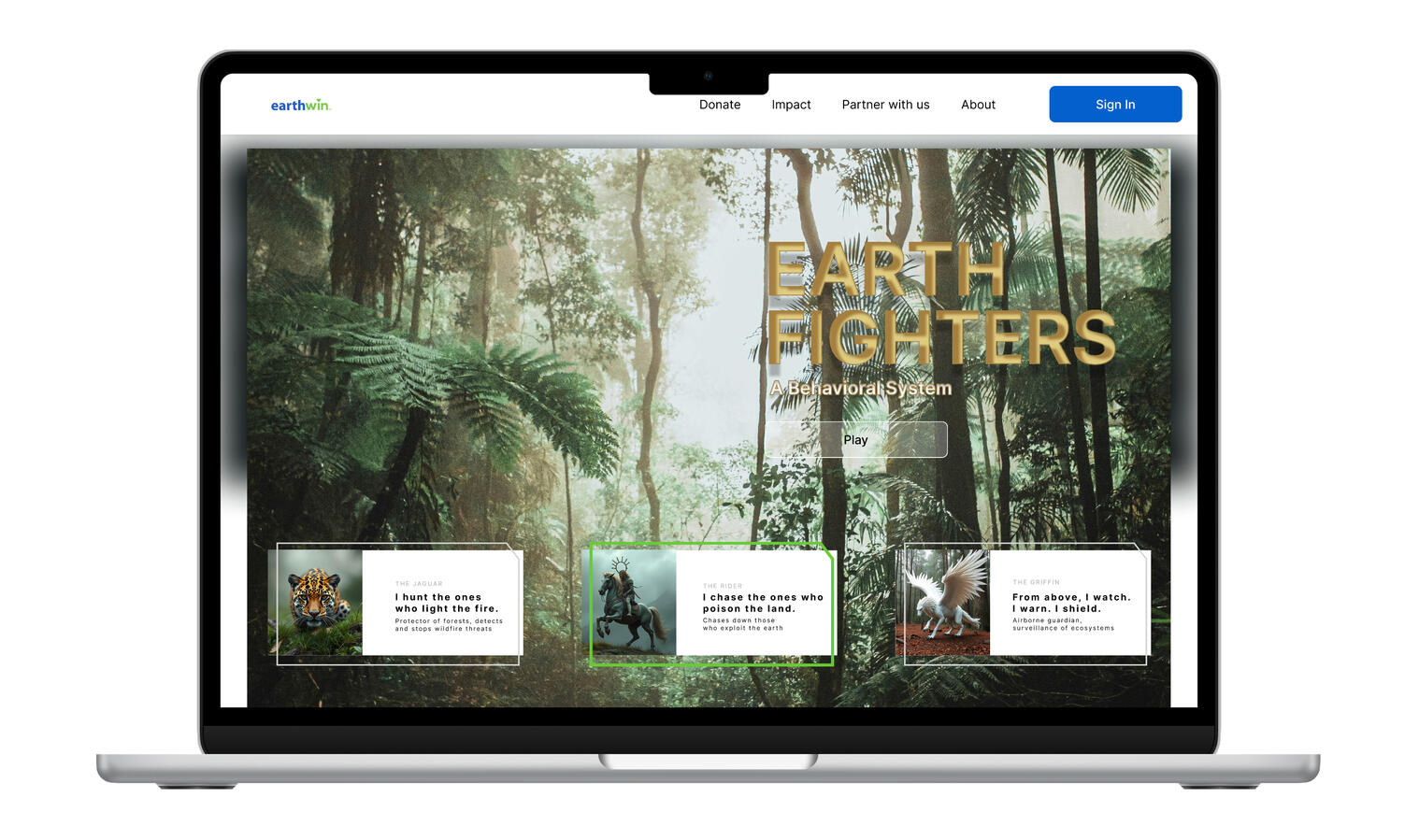
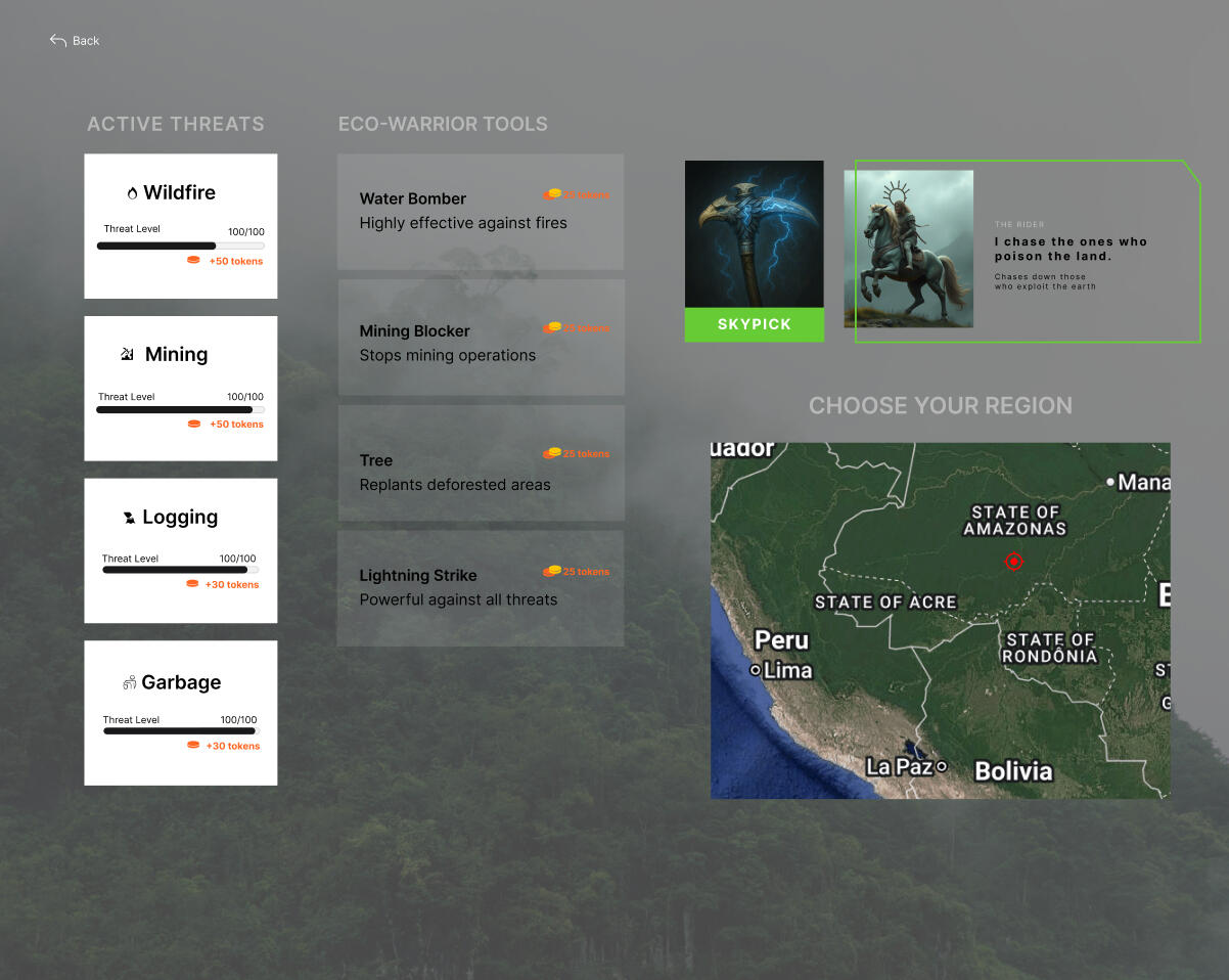
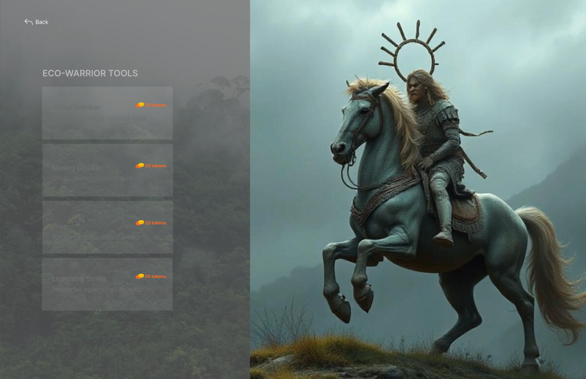
The Game: Earth Fighters (Behavioral Engagement System)
Earth Fighters is an engagement system designed to convert user urgency into meaningful action. The game functions as a behavioral bridge between awareness and participation, informed by interview insights where users expressed frustration, helplessness, and a desire to take immediate action.


Design Intent
The goal wasn’t to build just a game, but a Behavioral System, a space where frustration meets creation. By visualizing environmental action as a heroic journey, the interface motivates users to keep playing, contributing, and believing their actions matter.
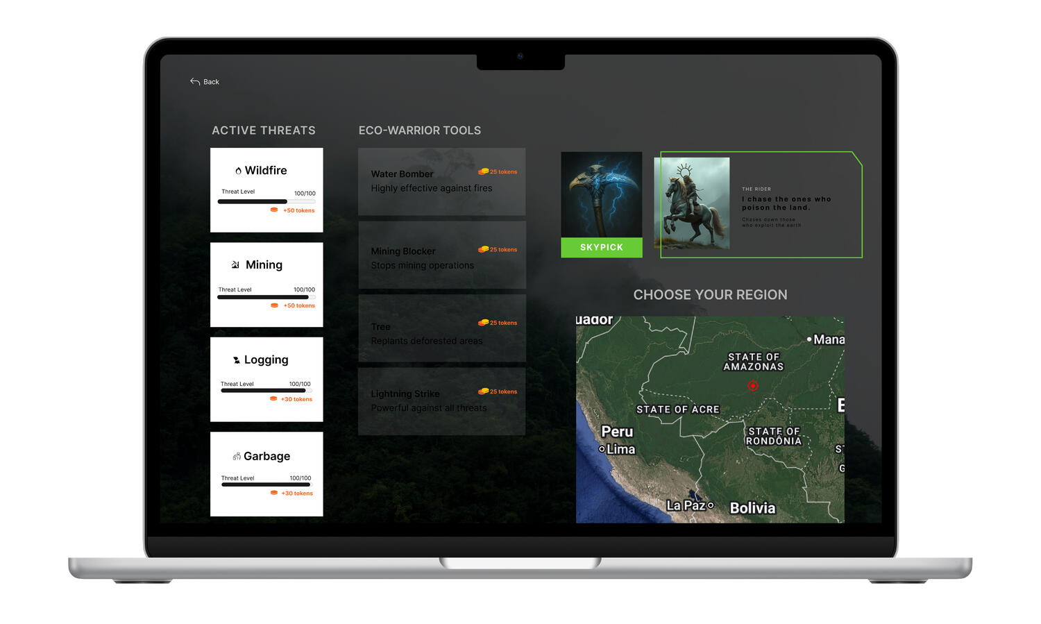
Concept
Players explore real-world environmental issues (wildfires, mining, logging, and waste) and respond through symbolic gameplay that rewards constructive action. Rather than fighting people, players combat “eco-threats,” using mythical avatars and elemental tools that represent protection, restoration, and regeneration.Crucially, the tokens earned in gameplay are the direct funding mechanism, converting into real-world eco-actions like tree planting or land preservation credits.Gameplay Flow
• Choose a region to defend (e.g., Amazon Rainforest).
• Select a character; Jaguar, Griffin or Rider, each symbolizing a different ecological archetype.
• Defeat threats to earn tokens.
• Tokens convert to Earthwin cryptocurrency, which can be used to plant trees, buy eco-products, or gift land preservation credits.
User Interface Design
Earthwin’s interface combines natural greens, deep blues, and earth neutrals to evoke authenticity and environmental harmony, intentionally building the trust necessary for a platform dealing with tokens and crypto. Subtle gradients reflect the transition from awareness to action, mirroring the user’s eco journey. Icons and motion cues are deliberately soft and circular, symbolizing continuity and community.
Typography uses Inter, chosen for its clarity and digital precision, ensuring readability across mobile and dashboard interfaces. Font weights (Bold,SemiBold, Medium, Regular) visually guide attention through the gamified structure: action → token → proof → reward.
Results & Impact
Usability Testing OutcomesTrust Validation
3/4 users stated that viewing contribution history increased their confidence in the platform.
→ 75% increase in perceived trustworthiness vs. traditional PDF reportsRetention Signal
2/4 participants said they would return specifically to check progress on tracked environmental impact.
→ 50% expressed intent to return (vs. 0/4 on donation-only flow)Engagement Improvement
Game prototype: 10-15 minutes avg. engagement
Donation-only flow: 3 minutes
→ 3-5 x engagement increaseTechnology Validation
4/4 users understood token-to-funding connection without crypto explanation
3/4 trusted blockchain verification over self-reported dashboards
→ Validated that complex tech could be simplified without losing valueDesign Iteration
Based on user confusion around abstract rewards, I pivoted from a generic "points"
system to a contribution timeline and simplified the token interface to reduce cognitive load.
Meratas / Career-Bond
Fintech | UX Fundamentals Project
Career-Bond (formerly Meratas) is a fintech platform helping students finance education through flexible loan programs. This project focused on improving trust and clarity during the loan exploration and application experience.
⚡ AT A GLANCE
Role: UX Designer • Deliverable: Research-backed UX proposal + interactive prototype
Research
• 4 user interviews (30 min)
• 2 usability testing rounds
Challenge
•40% distrust from hidden fees
• 30% drop-offs from confusing
• Decision paralysis
Solution
• Interactive calculator (new)
• 3-step transparent flow
• Simplified navigation
Impact
• "Clear, honest, easy" (4/4 testers)
• 100% cognitive load reduction
• Prototype delivered to stakeholders
The Challenge
Career-Bond's original platform presented complex loan details that overwhelmed users and lowered conversion rates during the application process. Many students found repayment breakdowns confusing and distrusted hidden costs. The challenge was to create a transparent, trustworthy experience that builds confidence from discovery to completion.
Problem 1:
Hidden Fee Distrust (40% of users)
The platform didn't show costs upfront. Users had to search for financial information, causing distrust and abandonment.
Problem 2:
Confusing Repayment Terms (30% drop-off)
Repayment breakdowns were unclear, making it difficult for students to understand what they'd actually owe.
Problem 3:
Decision Paralysis
Complex loan details overwhelmed users during the application process without clear guidance on what mattered most.
Our Approach
I began by asking a simple question
“Where is this trust issue coming from?”
I explored how small daily experiences shape user psychology around money and transparency.
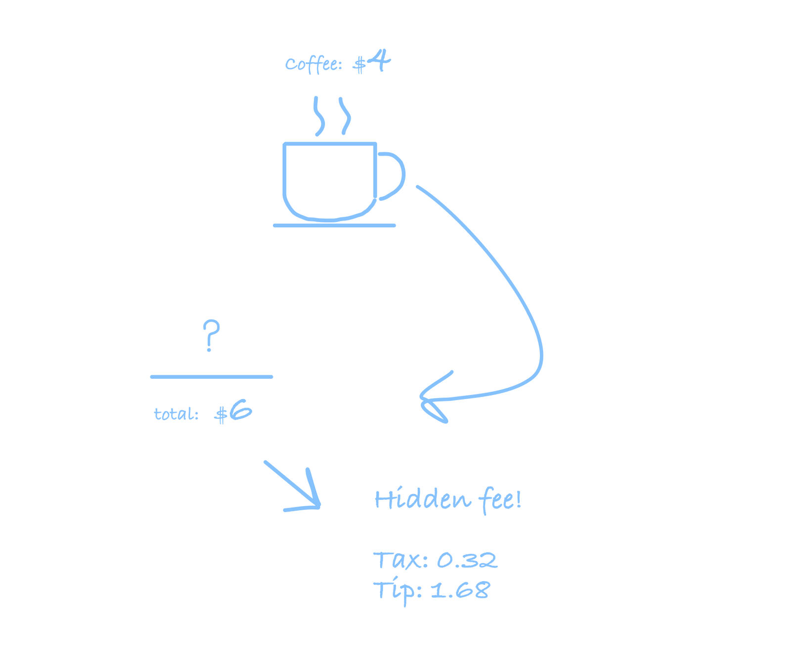
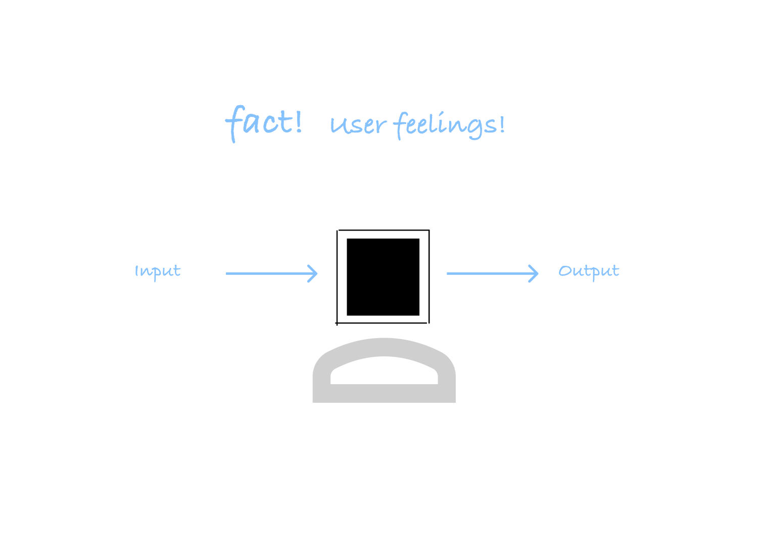
In the U.S., a coffee labeled $4 often ends up costing $6 after tax and tip. This constant mismatch between expectation and reality subconsciously teaches people "not to trust what they see" especially in bigger financial decisions like loans. This insight became the foundation of my design approach: transparency builds trust.
Teaching society not to trust what they see!
Understand The Business
During the rebrand from Meratas to Career-Bond, stakeholders aimed to increase application completion and communicate transparency as a core brand value. The UX needed to improve conversion during the application process, simplify decision-making, and reinforce credibility across every touchpoint.
Rebrand Goals:
Clarity, trust, and smoother application flow.
Understand The User
Through in-depth interviews with 4 people 2 new Master’s graduates (24 & 26 y.o.) funding bootcamps
2 career-switchers (31 & 38 y.o.) moving into tech, (30 min each) and 2 rounds of usability testing with prospective students."Exact script questions (top 3)-What’s your biggest concern when going through financial processes like this?
-Is there anything you wish these platforms offered that they currently don’t?
-What would make that process easier or more reassuring?
KEY USER INSIGHTS1. Hidden fees caused 40% distrust during signup
2. Confusing repayment breakdown led to 30% drop-offs
3. Lack of cost transparency created decision paralysis
I uncovered three core problems they faced, applicants reported;
1.Uncertainty around total cost and repayment details.
2. Many expected hidden fees and hesitated to proceed without seeing clear numbers first.
3. Trust and clarity emerged as the primary barriers to completion.
Understand The Platform
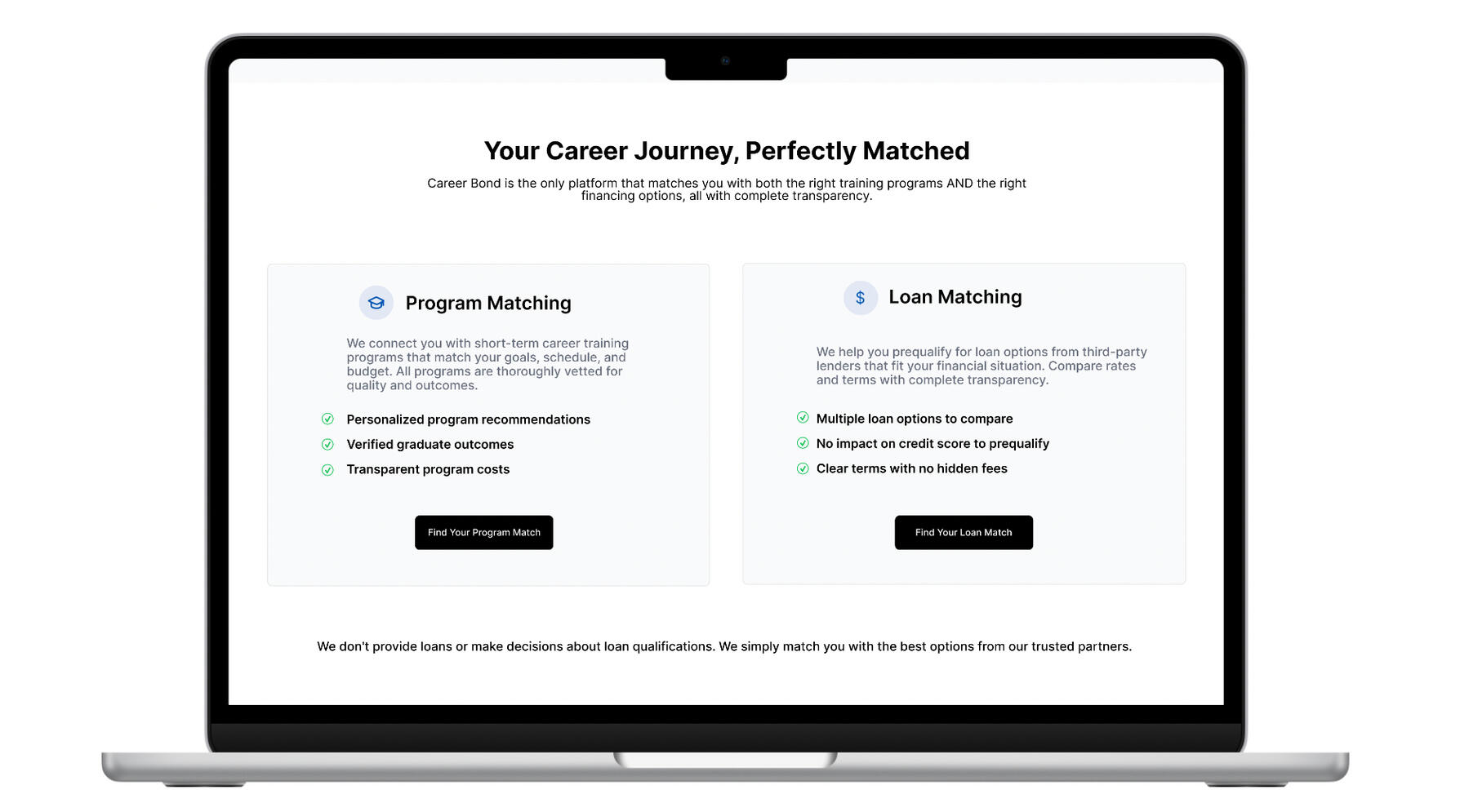
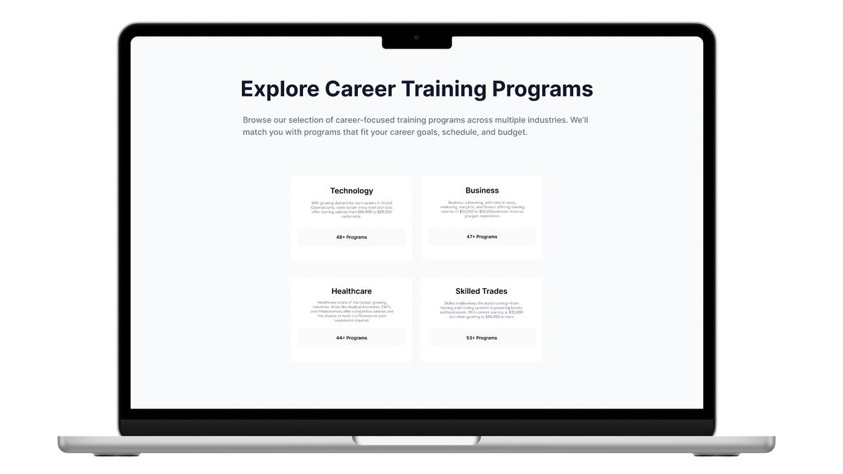
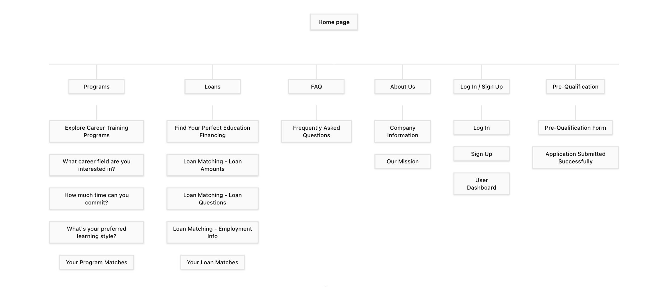
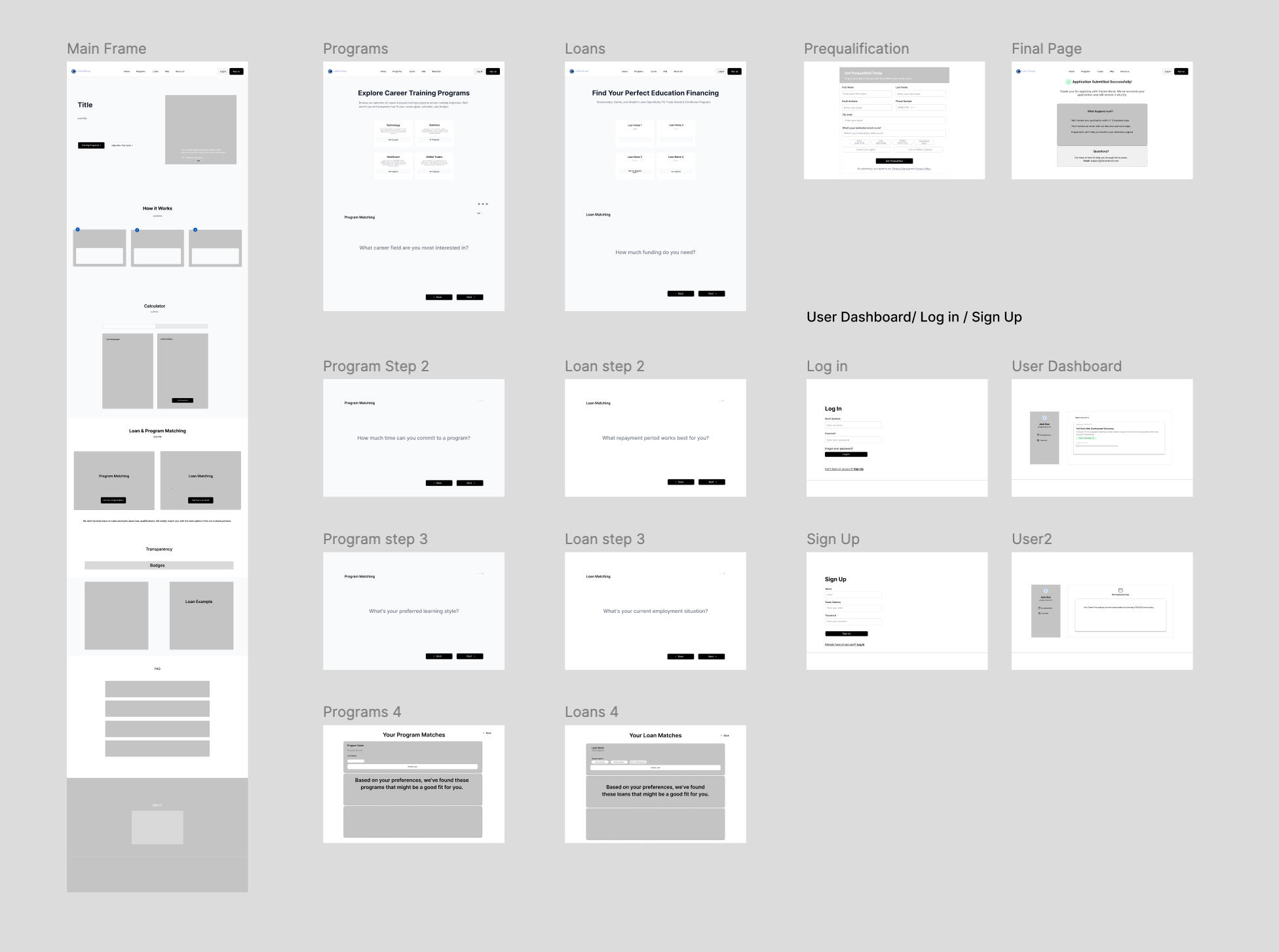
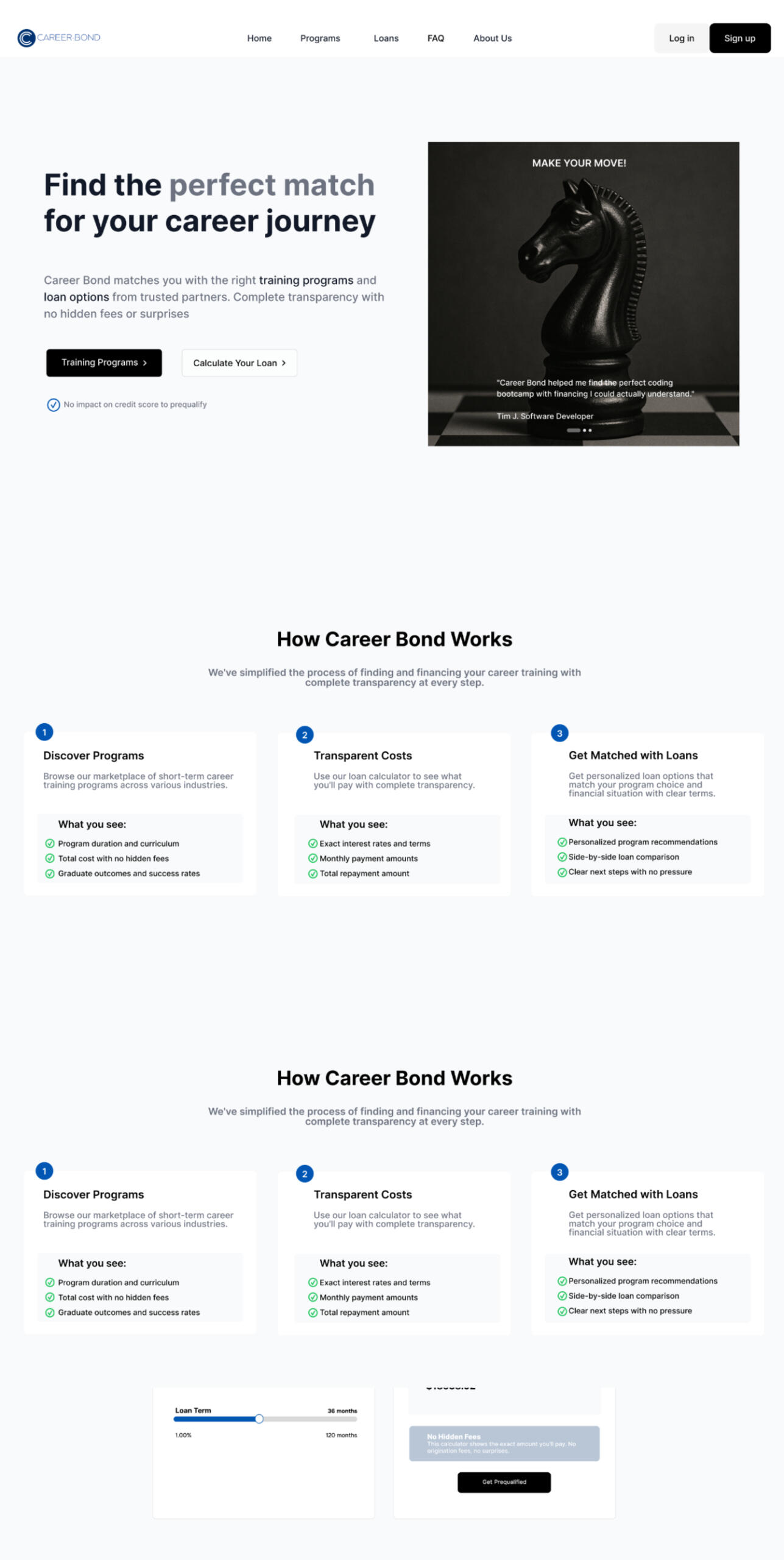
Before defining solutions, I mapped the existing CareerBond website to analyze how users moved through the loan discovery flow. Despite multiple entry points (“Apply Now,” “Tech Careers,” “Allied Health,” “Business Programs”), every button led to the same pre-qualification form regardless of intent or category.
Before
The landing page had no actionable CTAs only generic information and a single button that repeatedly led users to the personal information form.
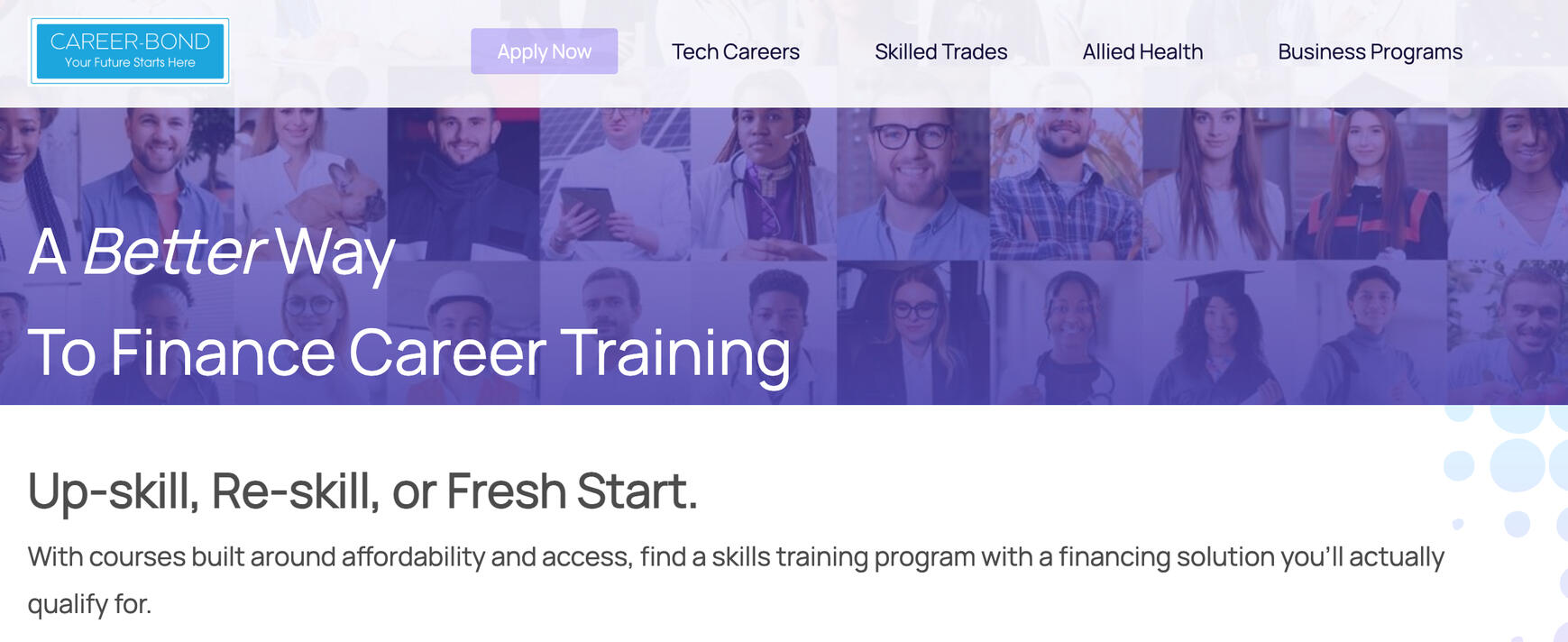
The CTA led users straight to a personal-information form without offering any real value. It looked like a three-step process, but in reality, it only collected data and after completing everything, users still had to wait for results by email.
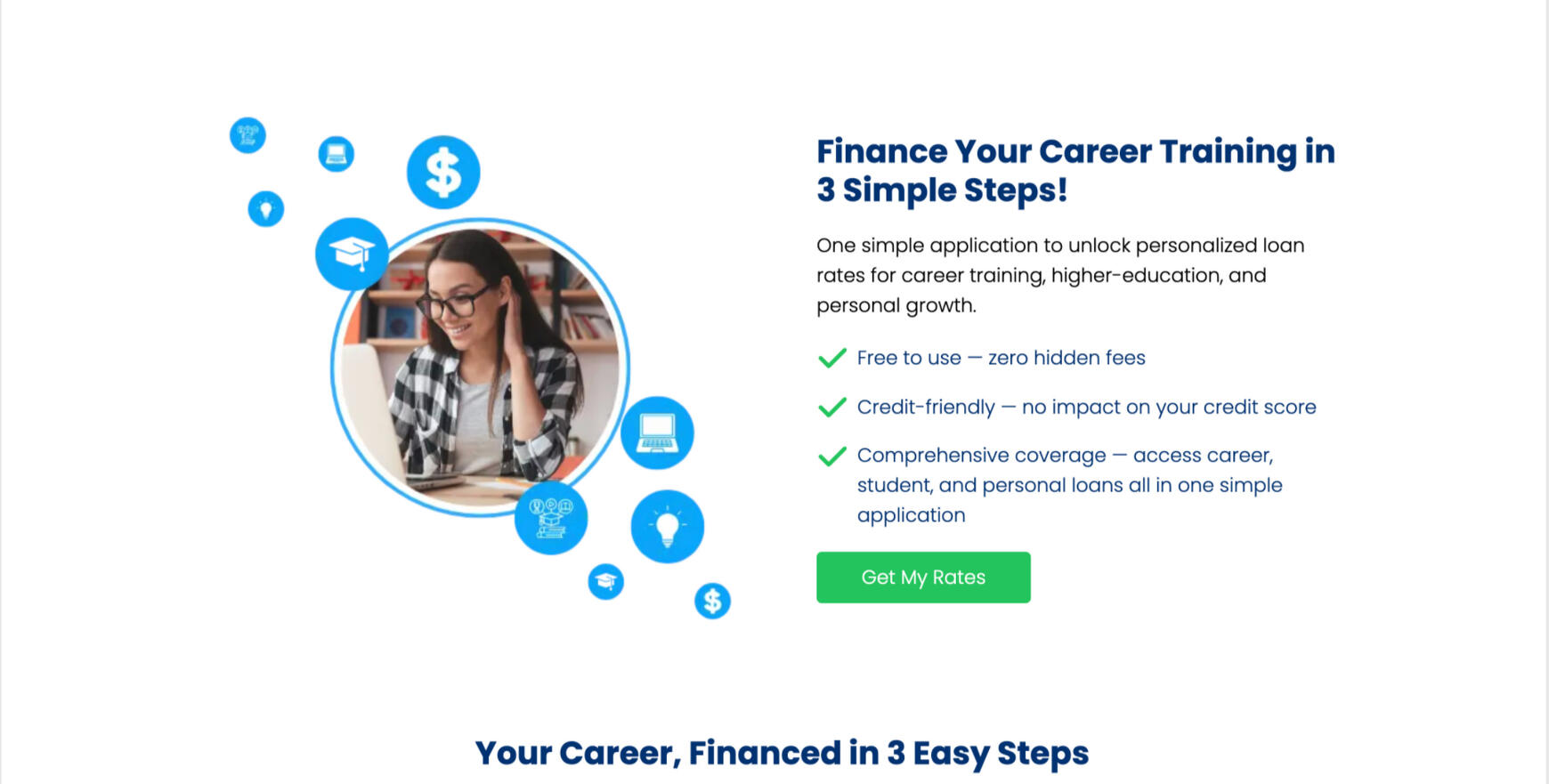
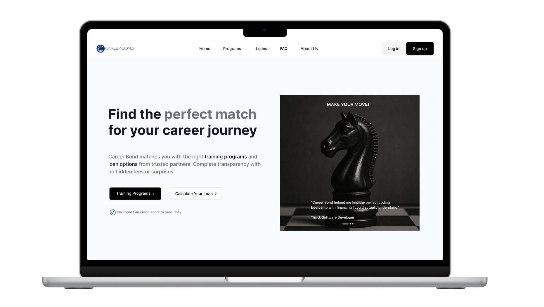
After
The redesigned landing page introduced clear, trust-building CTAs such as Explore Programs and Loan Calculator, offering immediate value before asking for personal data.
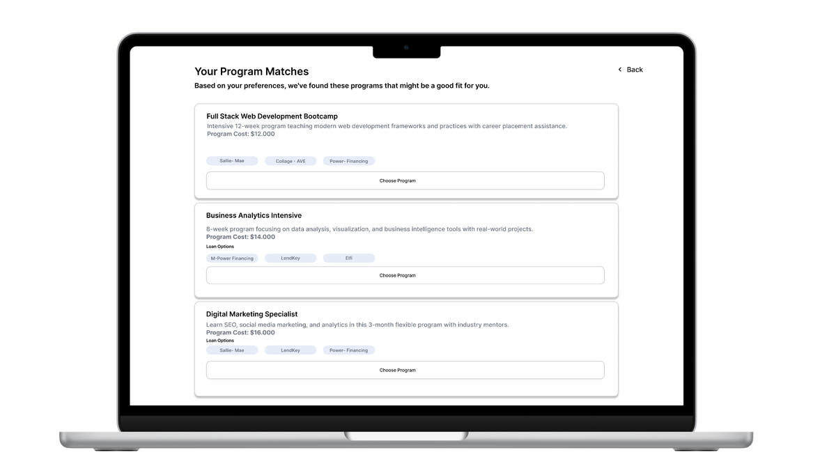
Redesigned the three-step flow to build trust and deliver value. Users can now explore Programs or Loan Matching to see which loans support each program, or vice versa. The interface displays this relationship clearly through dynamic “pill” indicators, giving instant transparency before commitment.
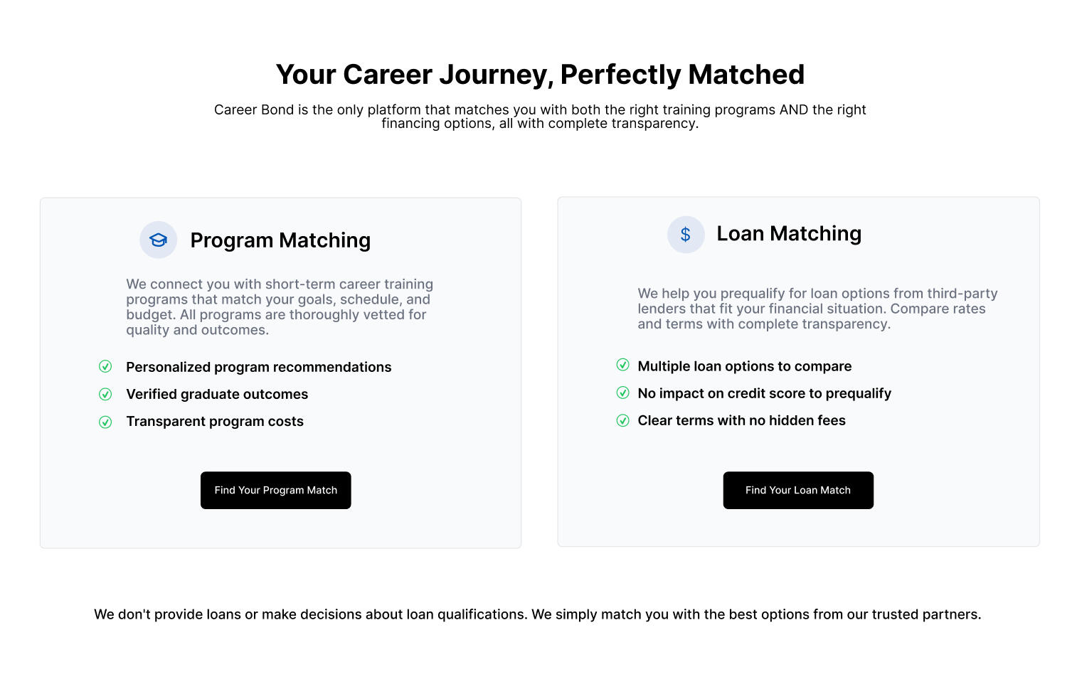
This illusion of choice eroded trust early in the journey. Users believed they were exploring tailored programs, but were instead redirected to the same generic page asking for personal details before showing any relevant information. Instead of guiding discovery,
the interface funneled every action into data capture, making the experience feel manipulative rather than supportive.
UX Insight: False Choice Destroys Trust
A key psychological trigger for distrust.
When multiple CTAs lead to the same page, users lose perceived control. Instead of feeling guided, they feel manipulated. In financial contexts, that emotion directly translates to abandonment and skepticism. True transparency isn’t about showing numbers, it’s about making every action feel honest and distinct.
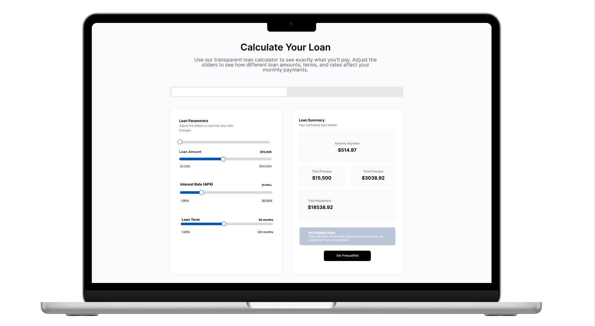
The Solution
The core problem stemmed from a lack of transparency users were asked for information before receiving value.
To rebuild trust, I designed an interactive loan calculator that showed real numbers upfront, helping users understand total repayment before committing. This shift from “Apply to see your rate” to “Preview before applying” created an open and confidence-driven flow.
User described;
"The loan journey feels like a black box" users are unsure what to expect.
User insights revealing emotional disconnect and the need for clarity before commitment.
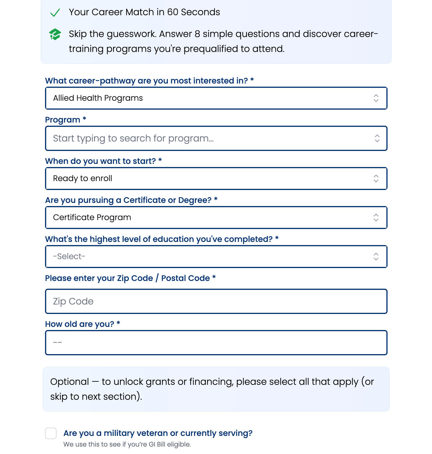
Feature 1: Simplified Application Entry Flow; preventing unnecessary repetition and user frustration.
The original toolbar redirected users to the same “Career Goals” form regardless of their intent. I restructured the entry points to distinguish between program discovery and loan options, preventing unnecessary repetition and user frustration.
Feature 2: Upfront Cost Visibility; I introduced an interactive loan calculator prototype showing repayment breakdowns.
Users hesitated to proceed without understanding total program costs. I introduced an interactive loan calculator prototype showing repayment breakdowns and total costs before personal data entry.
Feature 3: Clear Navigation Hierarchy; I proposed a simplified structure where users could first explore then preview financing.
The old multi-step form and program listing caused confusion. I proposed a simplified structure where users could first explore programs, then preview financing reducing perceived friction.
Existing interface: users struggled to locate relevant loan programs and understand repayment terms.
I designed calculator prototype with simplified breakdown and transparent costs.
Guiding users through a transparent progression with clear feedback at every stage.
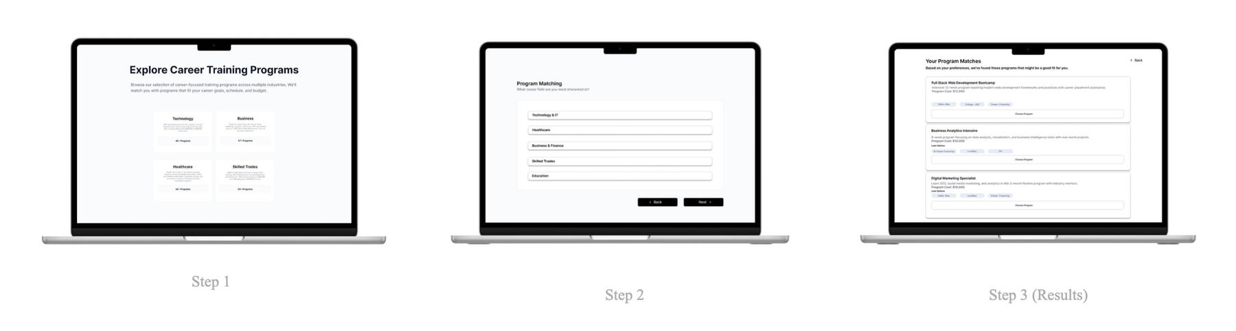
Three-step flow
Estimate, Verify, Apply.
Step 1
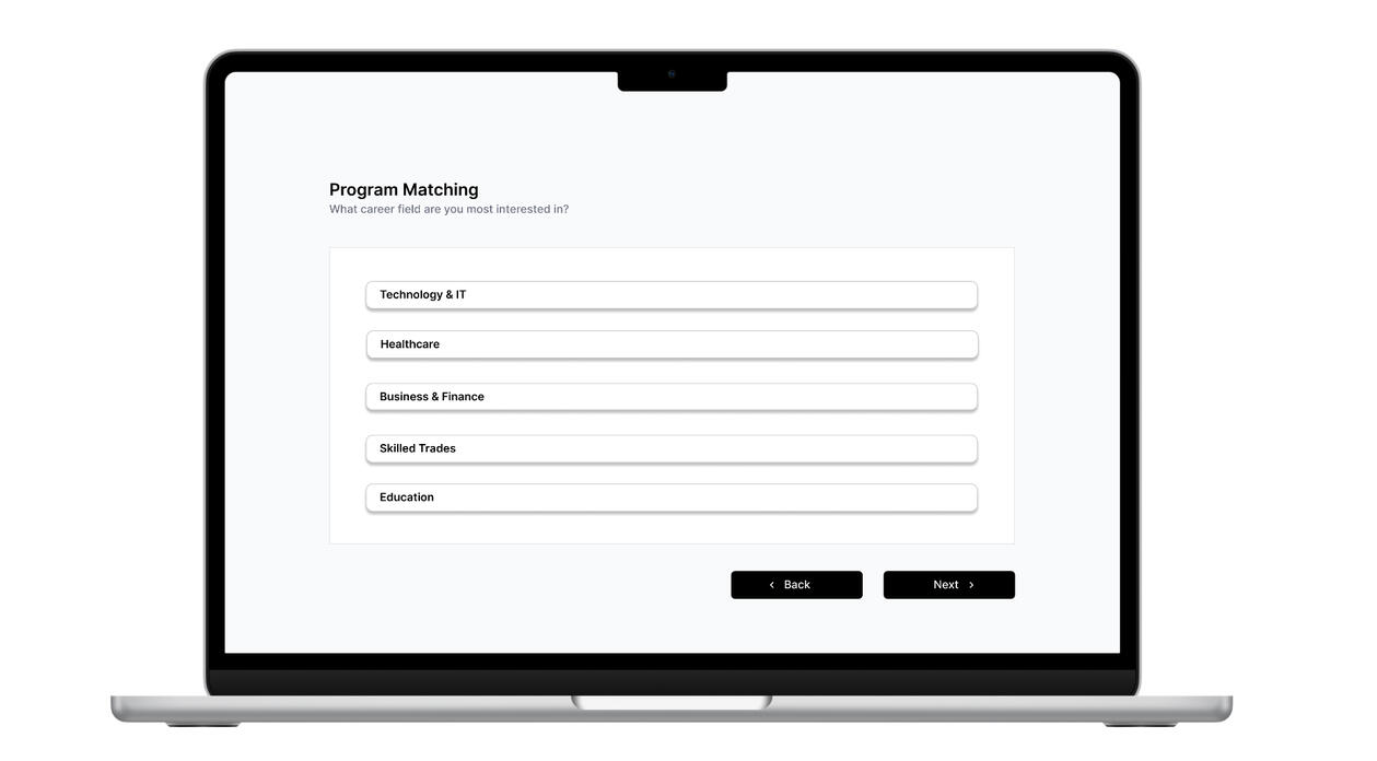
Step 2
Step 3 (Results)
Flow & Structure
Simplified page hierarchy reduced confusion and separated program discovery from loan qualification.
The platform flow was rebuilt around clarity breaking the process into three transparent stages: Estimate, Verify, and Apply. Each stage provides visible progress and upfront information before any personal data entry.
Information Architecture
Shows simplified page hierarchy for the redesigned platform.
Low-Fidelity Wireframes
Early structural sketches testing information order and user navigation clarity.
User Interface Design
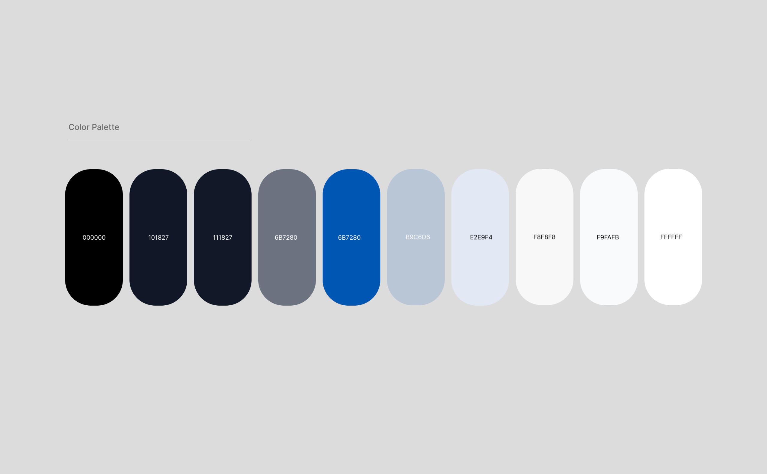
The palette gives the interface a confident identity without shouting. Deep navy and black signal credibility; a restrained blue accent adds focus. Neutral grays and off-whites keep attention on content. The result is bold yet minimal aligned with CareerBond’s values of honesty and transparency.
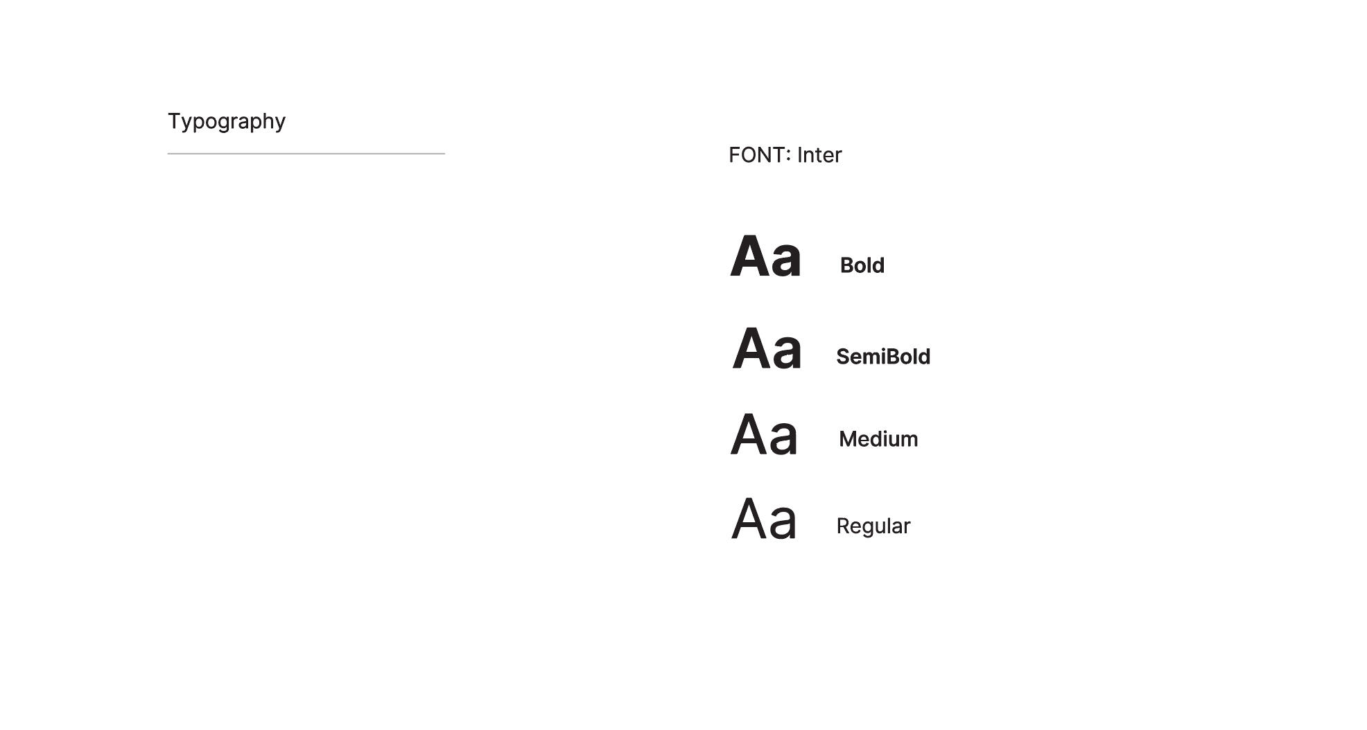
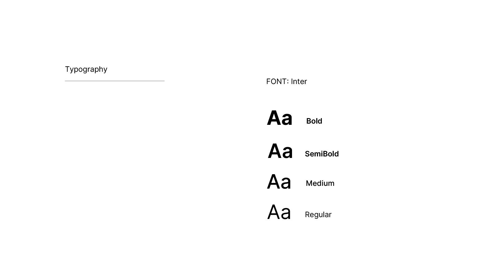
Using a clear hierarchy of Bold, SemiBold, Medium, and Regular weights guides attention naturally.
The interface uses Inter, a modern sans-serif typeface designed for digital clarity and balance. It's geometric simplicity makes complex financial data easy to scan while maintaining a professional tone.
From key actions to supportive information ensuring a consistent and accessible reading experience across all screens.
COMPOSITIONS
I developed desktop web compositions focused on hierarchy and ease of scanning. Each frame emphasized predictability, the psychological core of trust.
Key compositions included:
Pre-application estimator: Displayed total repayment before personal data entry. Simplified comparison view: Allowed users to understand multiple loan options at a glance. Guided input flow: Broke complex forms into calm, digestible sections. Completion screen: Framed confirmation as reassurance, not pressure.The compositions were built for clarity, not persuasion, a visual language that quietly earned belief through simplicity.
outcomes
Tested with the same 4 users before & after
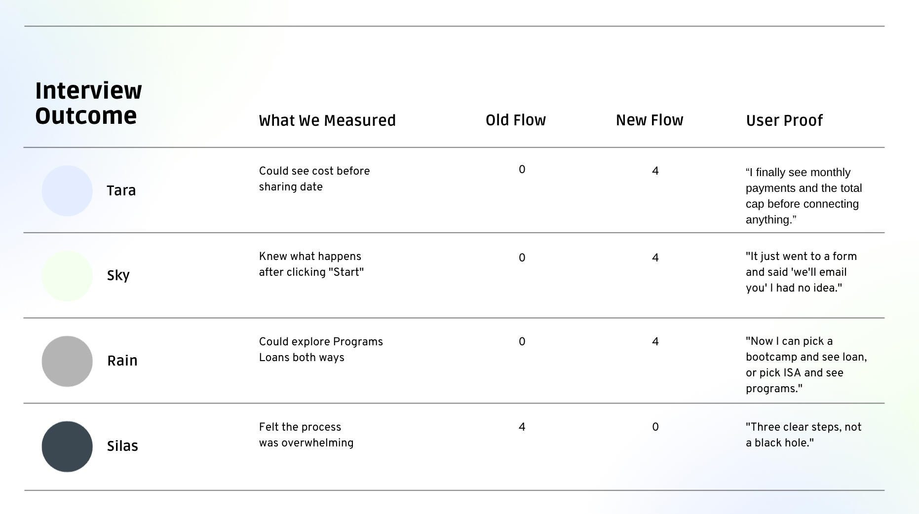
STRATEGIC IMPACTA trust-first UX framework for fintech- Truthfulness > Conversion: Built a model where users see real numbers first, not after data entry.- “Clear, honest, finally easy” direct quote from all 4 testers.- Scalable Design System:→ Transparency-first language (calculator, 2-way explore, 3-step flow)→ Reduced cognitive load by 100 % (per user feedback)→ Reusable for ISAs, student loans, career financing
This isn’t just a redesign, it’s a blueprint for any trust-sensitive financial product.
FINAL THOUGHTS
This project proved that great UX isn’t just about usability it’s about emotional integrity. Financial tools often fail not because users don’t understand them, but because they don’t believe them. The idea began with a coffee analogy how hidden costs shape distrust and evolved into a UX principle: when what users see is exactly what they get, trust becomes the design. That’s the benchmark I design for clarity so consistent that users never have to second-guess the product or themselves.
About
Su Barikan is a product designer based in New York City, known for her work at the intersection of contemporary art and digital media. She is the founder of Abstract State, a contemporary art publication and digital platform. Barikan established Abstract State to bridge the gap between contemporary art and digital audiences, overseeing the platform's brand strategy, editorial design, and complete digital ecosystem. Her work is characterized by the integration of fine arts principles with strategic user experience design.In recognition of her contributions to the field, Barikan was awarded the classification of "Extraordinary Ability in Visual Arts and Design" by the United States. Her design practice encompasses product development and digital strategy across various sectors, including environmental sustainability, financial technology, and wellness innovation.Barikan's educational background is multidisciplinary, combining studies in Philosophy at Istanbul University (2016–2022) with formal training in design and fine arts. She attended the Gerrit Rietveld Academy in Amsterdam for Art & Design (2010–2011) and the Royal Academy of Art in The Hague, where she studied Fashion Design & Textile (2011–2013) as a merit-based scholarship recipient.
B.A in Philosophy
Istanbul University
Istanbul, Turkey, 2016 - 2022Fashion Design & Textile
(Merit-based scholarship recipient)
The Royal Academy of Arts
The Hague, Netherlands, 2011 - 2013Foundation in Art & Design
Gerrit Rietveld Academy,
Amsterdam, Netherlands, 2010 - 2011
Interior Design
Leonardo da Vinci Project Istituto per l'Arte e il Restauro Palazzo Spinelli
Florence, Italy, 2004Interior Design Pera Fine Arts Institute
Istanbul, Turkey, 2003 - 2004
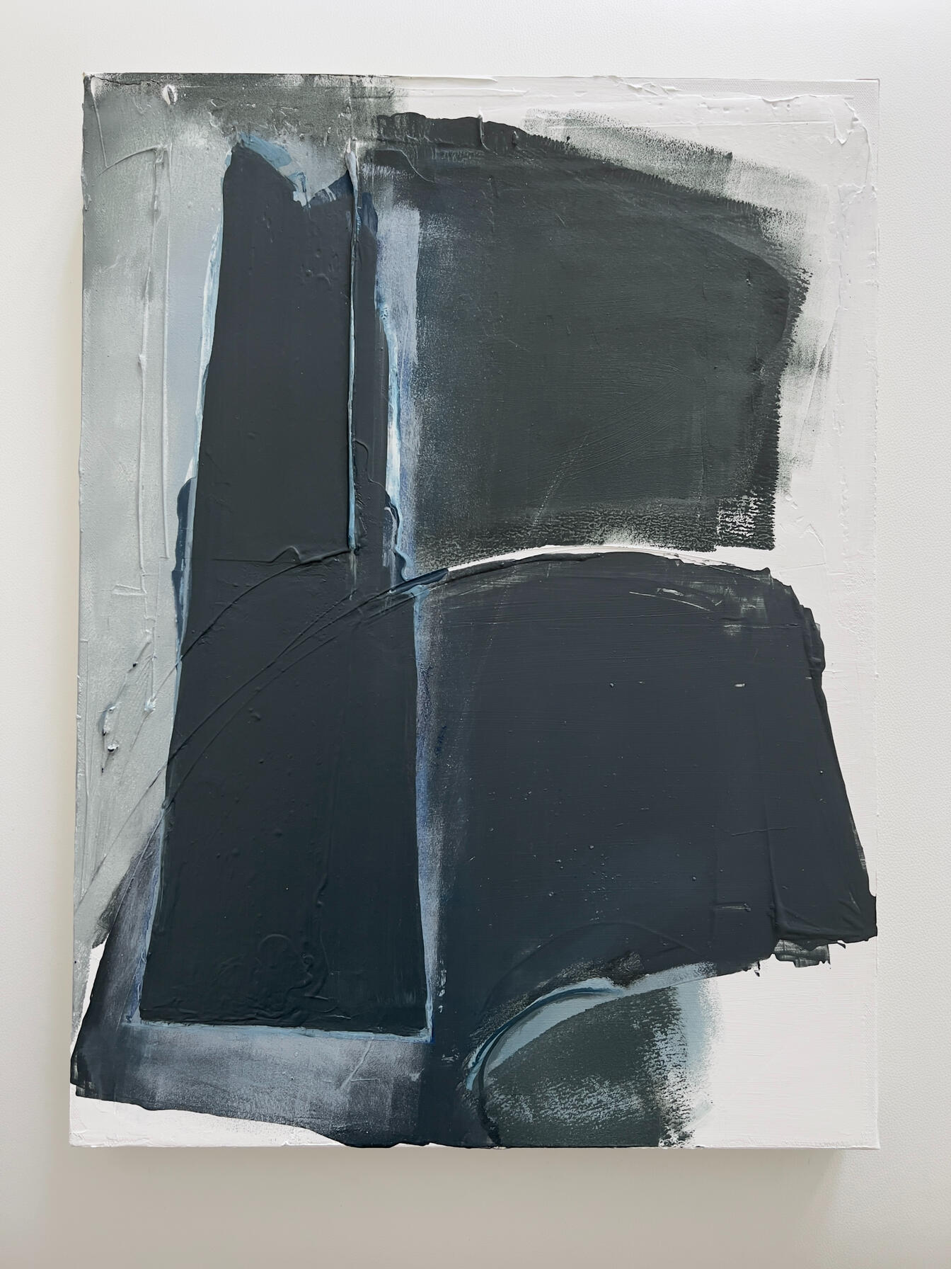
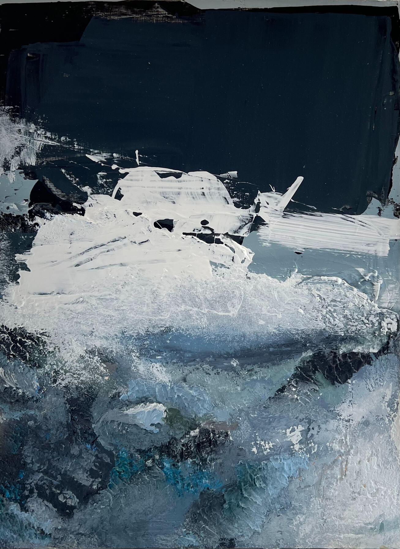
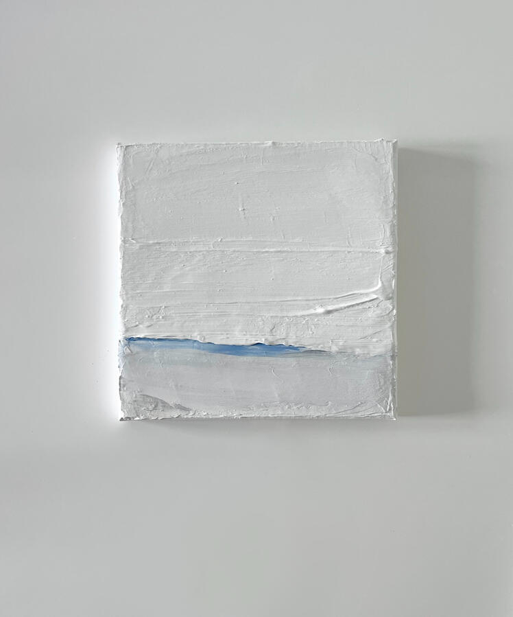
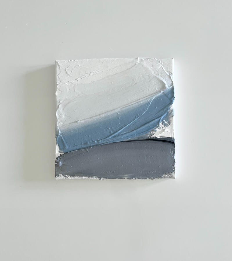
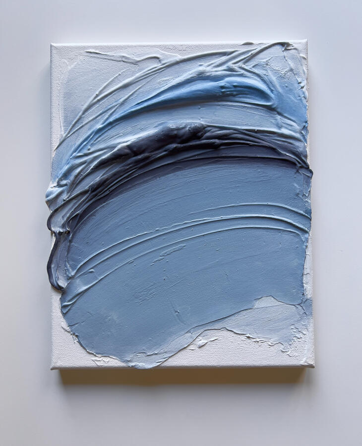
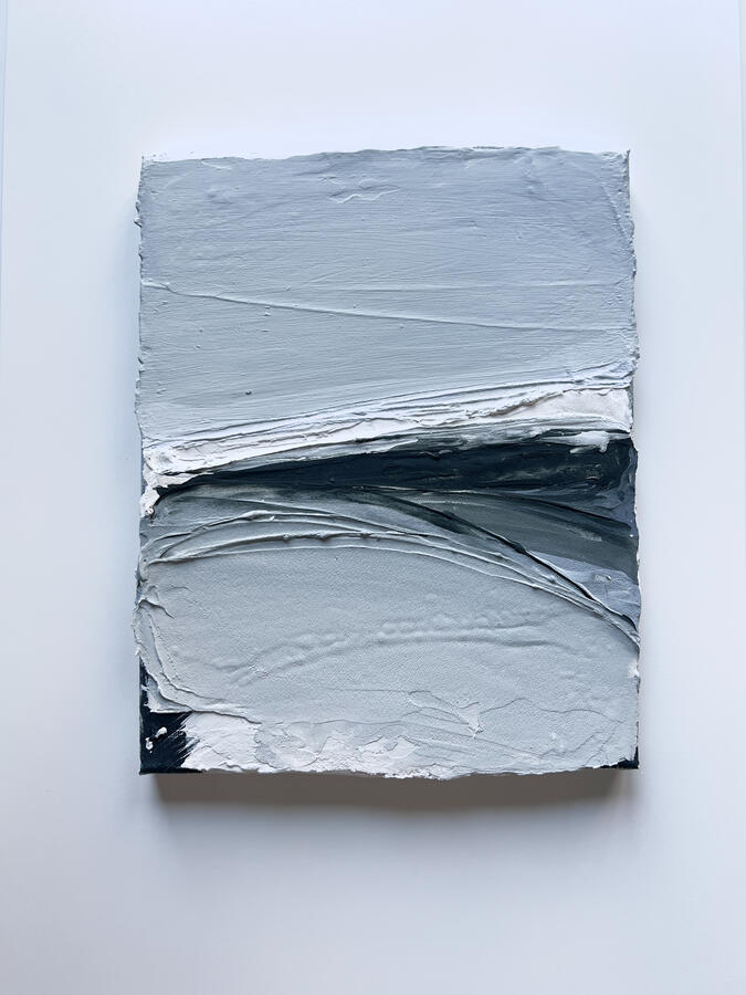
Ocean Series
The Playground
I believe playing is in our nature however in the process of growing up we replace toys with people which leads us to forget the harmless games we used to play. Suppressing our nature makes adulthood robotic instead of being poetics. But, whenever we go near the ocean, we leave ourselves in the arms of nature to our playground where we play in it, at any age. I'm creating this playground in my paintings to remind you to be poetic, to play, to be harmless.
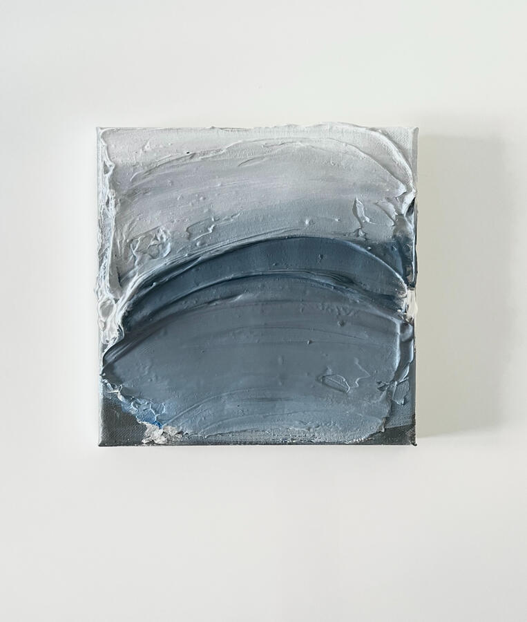
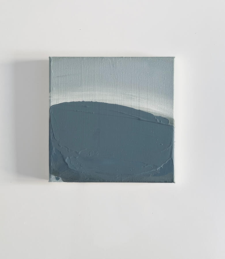
MANHATTAN COLLECTION
Size 18x24" Oil/Mixed media Paintings

No:20 M

No:22 M

No:27 M

No:28 M

Size 8x8" Oil/Mixed media

Sold

No:2 M

No:3 M

No:4 M

No:7 M

No:8 M

Size 8x10" Oil/Mixed media

No:13 M

No:14 M

No:15 M

No:16 M

No:17 M

No:5 M


2025
14 FEB - 16 FEB Arte Genova (Genova Art Fair) , Genova GE, Italy28 MAR - 30 MAR, Vernice Art Fair, Forlì, Italy24 MAY - 7 JUN, Dialogues With Time, Mega Art & AroundArt, Corchiano, Italy
2024
12 JAN - 17 JAN, Dreams & Nightmares 2nd Edition, Boomer Gallery, London, UK9 FEB - 14 FEB, The Dark Side, First Edition, Boomer Gallery, London, UK8 MAR - 13 MAR, The Inner World, Boomer Gallery, London, UK2 APR - 17 APR, DREAMS & NIGHTMARES 3RD EDITION, Boomer Gallery, London, UK20 APR - 28 APR, A Window on International Contemporary Art - Crema 2024, TD Art Gallery, Crema, Italy25 MAY - 7 JUN, SINTESI XIII Harmonies and Divergences Istanbul, Turkey
INTERVIEW
https://www.artistcloseup.com/blog/interview-su-barikanPRESS17 APR, Collect Art, Book Edition30 APR, Collect Art, Special Edition1 MAY, Artistcloseup Magazine, Issue 612 MAY, Al- Tiba9 Magazine, Issue 1327 JUL, Artist Talk Magazine, Issue 26
2023
MAR
3 MAR - 13 MAR, Of Integration, Van Der Plas Gallery, New York, USA13 MAR - 13 APR, The Holy Art Gallery, London, UK26 MAR - 23 APR, Royal Blue Gallery, UKAPR15 APR - 22 APR, All the Colors of The Art, Mega Art Gallery, Corchiano, Italy29 APR - 29 MAY, Collect Art, Tbilisi, GeorgiaMAY- JUNE5 MAY - 10 MAY, Walking With Giants, Boomer Gallery, London, UK23 MAY - 23 JUN, Untitled, Monat Gallery & Artsper, Madrid, Spain24 MAY - 2 JUNE, International Contemporary Art, Mega Art & Mo. C. A. Gallery, Rome, Italy26 MAY - 4 JUNE, The Bridge, Van Der Plas Gallery, New York, USAJUNE
9 JUN - 14 JUN, Vogue 6th Edition, Boomer Gallery, London, UK9 JUN - 11 JUN, ArtsLibris Barcelona, Artist's Book Fair, Al- Tiba9, Barcelona, SpainJULY6 JUL - 12 JUL, 1st. Contemporary Art Exhibition, Mega Art & Studio D'Arte Larkina Loreta, Venice, Italy7 JUL - 12 JUL, The New Renaissance, Boomer Gallery, London, UK13 JUL - 19 JUL, 2nd. Contemporary Art Exhibition, Mega Art & Studio D'Arte Larkina Loreta, Venice, Italy
6 JUL - 12 JUL, 1st. Contemporary Art Exhibition, Mega Art & Studio D'Arte Larkina Loreta, Venice, Italy7 JUL - 12 JUL, The New Renaissance, Boomer Gallery, London, UK13 JUL - 19 JUL, 2nd. Contemporary Art Exhibition, Mega Art & Studio D'Arte Larkina Loreta, Venice, ItalyAUG11 AUG - 16 AUG, The New Artist | 5th Edition, Boomer Gallery, London, UK16 AUG - 31 AUG, Panorama, Monat Gallery, Spain25 AUG - 27 AUG, Monaco Art Fair, MonacoSEP8 SEP - 13 SEP, What is Art | 6th Edition, Boomer Gallery, London, UK15 SEP - 29 SEP, Contea Caravaggio Museum, Mega Art Gallery, Sicily, Italy23 SEP - 29 SEP, Sintesi 2023 - Contaminations in Contemporary Art, Crocetti
Museum, Rome, ItalyOCT13 OCT - 18 OCT, Dreams & Nightmares 1st Edition, Boomer Gallery, London, UKNOV8 NOV - 17 NOV, Spazio Arte Tolomeo, Milano, Italy10 NOV - 15 NOV, Why do you do it | 1st Edition, Boomer Gallery, London, UKDEC15 DEC - 20 DEC, The New Artist | 6th Edition, Boomer Gallery, London, UK